2 State Toggle
Component Palette Icon:
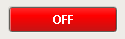
This button is similar to the basic Toggle Button, but more finely tuned to work in realistic controls environments. Use this button any time you want to toggle a value between two states, such as On/Off, Stop/Run, etc. If you have more than two states (for example, Hand/Off/Auto, use the Multi-State Button).
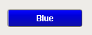
If you have a tag whose value you want to toggle between 2 values (like zero and one), you can simply drag and drop the tag onto the button. This will bind both the Control Value and Indicator Value properties to that tag. Now set the State 1 Value and State 2 Value to your two states (they default to zero and one, respectively). Lastly, use the Styles Customizer to define the styles for your two states.
This button has four integer values that you use to set it up: the Control Value, the Indicator Value, and values that define the 2 different states: State 1 Value and State 2 Value. Every time you press the button, one of the state values is written to the control value. The Indicator Value is used to determine which state you're in. For example, suppose that State 1 Value was zero and State 2 Value is one. If Indicator Value is zero and you press the button, it'll write a one to the Control Value. The Style of the component is typically driven by the read-only property Current State. Current State equals zero when Indicator Value=State 1 Value and one otherwise.
|
Name |
Description |
Property Type |
Scripting |
Category |
|
Antialias |
Draw with antialias on? Makes text smoother |
boolean |
.antialias |
Appearance |
|
Background 3D? |
Should this button have a 3d type background, or a flat color one? |
boolean |
.background3D |
Appearance |
|
Background Color |
The background color of the button. |
Color |
.buttonBG |
Appearance |
|
Border |
The border surrounding this component. NOTE that the border is unaffected by rotation. |
Border |
.border |
Common |
|
Border Painted? |
Should the border of this button be displayed? |
boolean |
.borderPainted |
Appearance |
|
Confirm Text |
The message to ask the user if confirmation is turned on. |
String |
.confirmText |
Behavior |
|
Confirm? |
If true, a confirmation box will be shown. |
boolean |
.confirm |
Behavior |
|
Control Value |
Bind this to the tag that controls the state. (Typically, this is bound to the same location as <i>Indicator Value</i>) |
int |
.controlValue |
Data |
|
Current State |
Read-only property that shows what state (0 or 1) this button is currently in. |
int |
.state |
Data |
|
Cursor |
The mouse cursor to use when hovering over this component. |
int |
.cursorCode |
Common |
|
Data Quality |
The data quality code for any tag bindings on this component. |
int |
.dataQuality |
Data |
|
Disabled Image Path |
The relative path of the image to be displayed when this component is not enabled. |
String |
.disabledPath |
Appearance |
|
Enabled |
If disabled, a component cannot be used. |
boolean |
.componentEnabled |
Common |
|
Fill Area? |
Controls whether or not this button's internal area is filled |
boolean |
.contentAreaFilled |
Appearance |
|
Focusable |
If a button is not focusable, you will not be able to interact with it with the keyboard. This means you can't "tab" over to it. |
boolean |
.focusable |
Behavior |
|
Font |
Font of text of this component |
Font |
.font |
Appearance |
|
Foreground Color |
The foreground color of the component. |
Color |
.foreground |
Appearance |
|
Horizontal Alignment |
The horizontal alignment of the button's contents (text and/or image) |
int |
.horizontalAlignment |
Layout |
|
Horizontal Text Position |
The horizontal position of the button's text relative to its image |
int |
.horizontalTextPosition |
Layout |
|
Icon-Text Spacing |
The space (in pixels) between the icon (if any) and the text (if any) |
int |
.iconTextGap |
Appearance |
|
Image Path |
The relative path of the image. |
String |
.path |
Appearance |
|
Indicator Value |
Bind this to the tag that indicates the current state. (Typically, this is bound to the same location as <i>Control Value</i>) |
int |
.indicatorValue |
Data |
|
Margin |
The space between a button's text and its borders. |
Insets |
.margin |
Layout |
|
Mnemonic |
A single letter that will activate the button using 'ALT-<i>mnemonic</i>'. |
String |
.mnemonicChar |
Behavior |
|
Mouseover Text |
The text that is displayed in the tooltip which pops up on mouseover of this component. |
String |
.toolTipText |
Common |
|
Name |
The name of this component. |
String |
.name |
Common |
|
Opaque |
Is this button completely opaque? Most aren't, so this should usually be false. |
boolean |
.opaque |
Common |
|
Rollover |
If true, the button may indicate that the mouse is hovering over it. |
boolean |
.rolloverEnabled |
Behavior |
|
State 1 Value |
The value that will be written to <b>controlValue</b> when the button is pushed in state 2. |
int |
.state1Value |
Data |
|
State 2 Value |
The value that will be written to <b>controlValue</b> when the button is pushed in state 1. |
int |
.state2Value |
Data |
|
Styles |
Contains the component's styles |
Dataset |
.styles |
Appearance |
|
Text |
Text of this component |
String |
.text |
Appearance |
|
Vertical Alignment |
The vertical alignment of the button's contents (text and/or image) |
int |
.verticalAlignment |
Layout |
|
Vertical Text Position |
The vertical position of the button's text relative to its image |
int |
.verticalTextPosition |
Layout |
|
Visible |
If disabled, the component will be hidden. |
boolean |
.visible |
Common |
This component does not have scripting functions associated with it.
This component does not have extension functions associated with it.
action
actionPerformed
This event occurs when a component that can receive input, such as a text box, receives the input focus. This usually occurs when a user clicks on the component or tabs over to it.
|
.source |
The component that fired this event |
focus
focusGained
This event occurs when a component that can receive input, such as a text box, receives the input focus. This usually occurs when a user clicks on the component or tabs over to it.
|
.source |
The component that fired this event. |
|
.oppositeComponent |
The other component involved in this focus change. That is, the component that lost focus in order for this one to gain it, or vise versa. |
focusLost
This event occurs when a component that had the input focus lost it to another component.
|
.source |
The component that fired this event |
|
.oppositeComponent |
The other component involved in this focus change. That is, the component that lost focus in order for this one to gain it, or vise versa. |
key
keyPressed
An integer that indicates whether the state was changed to "Selected" (on) or "Deselected" (off). Compare this to the event object's constants to determine what the new state is.
|
.source |
The component that fired this event. |
|
.keyCode |
The key code for this event. Used with the keyPressed and keyReleased events. See below for the key code constants. |
|
.keyChar |
The character that was typed. Used with the keyTyped event. |
|
.keyLocation |
Returns the location of the key that originated this key event. Some keys occur more than once on a keyboard, e.g. the left and right shift keys. Additionally, some keys occur on the numeric keypad. This provides a way of distinguishing such keys. See the KEY_LOCATION constants, the keyTyped event always has a location of KEY_LOCATION_UNKNOWN. |
|
.altDown |
True (1) if the Alt key was held down during this event, false (0) otherwise. |
|
.controlDown |
True (1) if the Control key was held down during this event, false (0) otherwise. |
|
.shiftDown |
True (1) if the Shift key was held down during this event, false (0) otherwise. |
keyReleased
Fires when a key is released and the source component has the input focus. Works for all characters, including non-printable ones, such as SHIFT and F3.
|
.source |
The component that fired this event. |
|
.keyCode |
The key code for this event. Used with the keyPressed and keyReleased events. See below for the key code constants. |
|
.keyChar |
The character that was typed. Used with the keyTyped event. |
|
.keyLocation |
Returns the location of the key that originated this key event. Some keys occur more than once on a keyboard, e.g. the left and right shift keys. Additionally, some keys occur on the numeric keypad. This provides a way of distinguishing such keys. See the KEY_LOCATION constants in the documentation, the keyTyped event always has a location of KEY_LOCATION_UNKNOWN. |
|
.altDown |
True (1) if the Alt key was held down during this event, false (0) otherwise. |
|
.controlDown |
True (1) if the Control key was held down during this event, false (0) otherwise. |
|
.shiftDown |
True (1) if the Shift key was held down during this event, false (0) otherwise. |
keyTyped
Fires when a key is pressed and then released when source component has the input focus. Only works for characters that can be printed on the screen.
|
.source |
The component that fired this event. |
|
.keyCode |
The key code for this event. Used with the keyPressed and keyReleased events. See below for the key code constants. |
|
.keyChar |
The character that was typed. Used with the keyTyped event. |
|
.keyLocation |
Returns the location of the key that originated this key event. Some keys occur more than once on a keyboard, e.g. the left and right shift keys. Additionally, some keys occur on the numeric keypad. This provides a way of distinguishing such keys. See the KEY_LOCATION constants in the documentation, the keyTyped event always has a location of KEY_LOCATION_UNKNOWN. |
|
.altDown |
True (1) if the Alt key was held down during this event, false (0) otherwise. |
|
.controlDown |
True (1) if the Control key was held down during this event, false (0) otherwise. |
|
.shiftDown |
True (1) if the Shift key was held down during this event, false (0) otherwise. |
mouse
mouseClicked
This event signifies a mouse click on the source component. A mouse click the combination of a mouse press and a mouse release, both of which must have occurred over the source component. Note that this event fires after the pressed and released events have fired.
|
.source |
The component that fired this event. |
|
.button |
The code for the button that caused this event to fire. |
|
.clickCount |
The number of mouse clicks associated with this event. |
|
.x |
The x-coordinate (with respect to the source component) of this mouse event. |
|
.y |
The y-coordinate (with respect to the source component) of this mouse event. |
|
.popupTrigger |
Returns True (1) if this mouse event is a popup trigger. What constitutes a popup trigger is operating system dependent, which is why this abstraction exists. |
|
.altDown |
True (1) if the Alt key was held down during this event, false (0) otherwise. |
|
.controlDown |
True (1) if the Control key was held down during this event, false (0) otherwise. |
|
.shiftDown |
True (1) if the Shift key was held down during this event, false (0) otherwise. |
mouseEntered
This event fires when the mouse enters the space over the source component.
|
.source |
The component that fired this event. |
|
.button |
The code for the button that caused this event to fire. |
|
.clickCount |
The number of mouse clicks associated with this event. |
|
.x |
The x-coordinate (with respect to the source component) of this mouse event. |
|
.y |
The y-coordinate (with respect to the source component) of this mouse event. |
|
.popupTrigger |
Returns True (1) if this mouse event is a popup trigger. What constitutes a popup trigger is operating system dependent, which is why this abstraction exists. |
|
.altDown |
True (1) if the Alt key was held down during this event, false (0) otherwise. |
|
.controlDown |
True (1) if the Control key was held down during this event, false (0) otherwise. |
|
.shiftDown |
True (1) if the Shift key was held down during this event, false (0) otherwise. |
mouseExited
This event fires when the mouse leaves the space over the source component.
|
.source |
The component that fired this event. |
|
.button |
The code for the button that caused this event to fire. |
|
.clickCount |
The number of mouse clicks associated with this event. |
|
.x |
The x-coordinate (with respect to the source component) of this mouse event. |
|
.y |
The y-coordinate (with respect to the source component) of this mouse event. |
|
.popupTrigger |
Returns True (1) if this mouse event is a popup trigger. What constitutes a popup trigger is operating system dependent, which is why this abstraction exists. |
|
.altDown |
True (1) if the Alt key was held down during this event, false (0) otherwise. |
|
.controlDown |
True (1) if the Control key was held down during this event, false (0) otherwise. |
|
.shiftDown |
True (1) if the Shift key was held down during this event, false (0) otherwise. |
mousePressed
This event fires when a mouse button is pressed down on the source component.
|
.source |
The component that fired this event. |
|
.button |
The code for the button that caused this event to fire. |
|
.clickCount |
The number of mouse clicks associated with this event. |
|
.x |
The x-coordinate (with respect to the source component) of this mouse event. |
|
.y |
The y-coordinate (with respect to the source component) of this mouse event. |
|
.popupTrigger |
Returns True (1) if this mouse event is a popup trigger. What constitutes a popup trigger is operating system dependent, which is why this abstraction exists. |
|
.altDown |
True (1) if the Alt key was held down during this event, false (0) otherwise. |
|
.controlDown |
True (1) if the Control key was held down during this event, false (0) otherwise. |
|
.shiftDown |
True (1) if the Shift key was held down during this event, false (0) otherwise. |
mouseReleased
This event fires when a mouse button is released, if that mouse button's press happened over this component.
|
.source |
The component that fired this event. |
|
.button |
The code for the button that caused this event to fire. |
|
.clickCount |
The number of mouse clicks associated with this event. |
|
.x |
The x-coordinate (with respect to the source component) of this mouse event. |
|
.y |
The y-coordinate (with respect to the source component) of this mouse event. |
|
.popupTrigger |
Returns True (1) if this mouse event is a popup trigger. What constitutes a popup trigger is operating system dependent, which is why this abstraction exists. |
|
.altDown |
True (1) if the Alt key was held down during this event, false (0) otherwise. |
|
.controlDown |
True (1) if the Control key was held down during this event, false (0) otherwise. |
|
.shiftDown |
True (1) if the Shift key was held down during this event, false (0) otherwise. |
mouseMotion
mouseDragged
Fires when the mouse moves over a component after a button has been pushed.
|
.source |
The component that fired this event. |
|
.button |
The code for the button that caused this event to fire. |
|
.clickCount |
The number of mouse clicks associated with this event. |
|
.x |
The x-coordinate (with respect to the source component) of this mouse event. |
|
.y |
The y-coordinate (with respect to the source component) of this mouse event. |
|
.popupTrigger |
Returns True (1) if this mouse event is a popup trigger. What constitutes a popup trigger is operating system dependent, which is why this abstraction exists. |
|
.altDown |
True (1) if the Alt key was held down during this event, false (0) otherwise. |
|
.controlDown |
True (1) if the Control key was held down during this event, false (0) otherwise. |
|
.shiftDown |
True (1) if the Shift key was held down during this event, false (0) otherwise. |
mouseMoved
Fires when the mouse moves over a component, but no buttons are pushed.
|
.source |
The component that fired this event. |
|
.button |
The code for the button that caused this event to fire. |
|
.clickCount |
The number of mouse clicks associated with this event. |
|
.x |
The x-coordinate (with respect to the source component) of this mouse event. |
|
.y |
The y-coordinate (with respect to the source component) of this mouse event. |
|
.popupTrigger |
Returns True (1) if this mouse event is a popup trigger. What constitutes a popup trigger is operating system dependent, which is why this abstraction exists. |
|
.altDown |
True (1) if the Alt key was held down during this event, false (0) otherwise. |
|
.controlDown |
True (1) if the Control key was held down during this event, false (0) otherwise. |
|
.shiftDown |
True (1) if the Shift key was held down during this event, false (0) otherwise. |
propertyChange
propertyChange
Fires whenever a bindable property of the source component changes. This works for standard and custom (dynamic) properties.
|
.source |
The component that fired this event. |
|
.newValue |
The new value that this property changed to. |
|
.oldValue |
The value that this property was before it changed. |
|
.propertyName |
The name of the property that changed. NOTE: remember to always filter out these events for the property that you are looking for! Components often have many properties that change. |
|
Property Name |
Dataset |
|
Styles |
|
