Thermometer
Component Palette Icon:
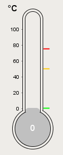
This component displays a temperature value depicted as a level in a mercury thermometer. Three temperature intervals can optionally be defined with their own colors. The mercury will change color based on the range that it is in.
|
Name |
Description |
Property Type |
Scripting |
Category |
|
Axis Label Color |
The color of the meter's y-axis label. |
Color |
.axisColor |
Appearance |
|
Border |
The border surrounding this component. NOTE that the border is unaffected by rotation. |
Border |
.border |
Common |
|
Cursor |
The mouse cursor to use when hovering over this component. |
int |
.cursorCode |
Common |
|
Data Quality |
The data quality code for any tag bindings on this component. |
int |
.dataQuality |
Data |
|
Follow data in ranges |
If true, the thermometer's Y axis will scale itself to zoom in on the current range. |
boolean |
.followDataInSubranges |
Behavior |
|
Interval 1 Color |
The color of this interval. |
Color |
.interval1Color |
Intervals |
|
Interval 1 High |
The upper bound of this interval. |
double |
.interval1High |
Intervals |
|
Interval 1 Low |
The lower bound of this interval. |
double |
.interval1Low |
Intervals |
|
Interval 2 Color |
The color of this interval. |
Color |
.interval2Color |
Intervals |
|
Interval 2 High |
The upper bound of this interval. |
double |
.interval2High |
Intervals |
|
Interval 2 Low |
The lower bound of this interval. |
double |
.interval2Low |
Intervals |
|
Interval 3 Color |
The color of this interval. |
Color |
.interval3Color |
Intervals |
|
Interval 3 High |
The upper bound of this interval. |
double |
.interval3High |
Intervals |
|
Interval 3 Low |
The lower bound of this interval. |
double |
.interval3Low |
Intervals |
|
Mercury Color |
The default color of the mercury. |
Color |
.mercuryColor |
Appearance |
|
Mouseover Text |
The text that is displayed in the tooltip which pops up on mouseover of this component. |
String |
.toolTipText |
Common |
|
Name |
The name of this component. |
String |
.name |
Common |
|
Overall High Bound |
The high bound for the whole thermometer |
double |
.overallHigh |
Data |
|
Overall Low Bound |
The lower bound for the whole thermometer |
double |
.overallLow |
Data |
|
Styles |
Contains the component's styles |
Dataset |
.styles |
Appearance |
|
Thermometer Color |
The color of the outline of the thermometer. |
Color |
.thermometerColor |
Appearance |
|
Thermometer Width |
The width of the lines used to draw the thermometer |
int |
.strokeWidth |
Appearance |
|
Units |
A string to describe the units for the current value label. |
int |
.units |
Appearance |
|
Use Range Color |
Controls whether or not the mercury color changes based on the range it is in |
boolean |
.useSubrangePaint |
Appearance |
|
Value |
The value to display in this thermometer. The mercury level and value label will change to reflect this. |
double |
.value |
Data |
|
Value Color |
The color of the meter's current value label. |
Color |
.valueColor |
Appearance |
|
Value Label Font |
The font to use for the current value label. |
Font |
.valueFont |
Appearance |
|
Visible |
If disabled, the component will be hidden. |
boolean |
.visible |
Common |
This component does not have scripting functions associated with it.
This component does not have extension functions associated with it.
mouse
mouseClicked
This event signifies a mouse click on the source component. A mouse click the combination of a mouse press and a mouse release, both of which must have occurred over the source component. Note that this event fires after the pressed and released events have fired.
|
.source |
The component that fired this event |
|
.button |
The code for the button that caused this event to fire. |
|
.clickCount |
The number of mouse clicks associated with this event. |
|
.x |
The x-coordinate (with respect to the source component) of this mouse event. |
|
.y |
The y-coordinate (with respect to the source component) of this mouse event. |
|
.popupTrigger |
Returns True (1) if this mouse event is a popup trigger. What constitutes a popup trigger is operating system dependent, which is why this abstraction exists. |
|
.altDown |
True (1) if the Alt key was held down during this event, false (0) otherwise. |
|
.controlDown |
True (1) if the Control key was held down during this event, false (0) otherwise. |
|
.shiftDown |
True (1) if the Shift key was held down during this event, false (0) otherwise. |
mouseEntered
This event fires when the mouse enters the space over the source component.
|
.source |
The component that fired this event |
|
.button |
The code for the button that caused this event to fire. |
|
.clickCount |
The number of mouse clicks associated with this event. |
|
.x |
The x-coordinate (with respect to the source component) of this mouse event. |
|
.y |
The y-coordinate (with respect to the source component) of this mouse event. |
|
.popupTrigger |
Returns True (1) if this mouse event is a popup trigger. What constitutes a popup trigger is operating system dependent, which is why this abstraction exists. |
|
.altDown |
True (1) if the Alt key was held down during this event, false (0) otherwise. |
|
.controlDown |
True (1) if the Control key was held down during this event, false (0) otherwise. |
|
.shiftDown |
True (1) if the Shift key was held down during this event, false (0) otherwise. |
mouseExited
This event fires when the mouse leaves the space over the source component.
|
.source |
The component that fired this event |
|
.button |
The code for the button that caused this event to fire. |
|
.clickCount |
The number of mouse clicks associated with this event. |
|
.x |
The x-coordinate (with respect to the source component) of this mouse event. |
|
.y |
The y-coordinate (with respect to the source component) of this mouse event. |
|
.popupTrigger |
Returns True (1) if this mouse event is a popup trigger. What constitutes a popup trigger is operating system dependent, which is why this abstraction exists. |
|
.altDown |
True (1) if the Alt key was held down during this event, false (0) otherwise. |
|
.controlDown |
True (1) if the Control key was held down during this event, false (0) otherwise. |
|
.shiftDown |
True (1) if the Shift key was held down during this event, false (0) otherwise. |
mousePressed
This event fires when a mouse button is pressed down on the source component.
|
.source |
The component that fired this event |
|
.button |
The code for the button that caused this event to fire. |
|
.clickCount |
The number of mouse clicks associated with this event. |
|
.x |
The x-coordinate (with respect to the source component) of this mouse event. |
|
.y |
The y-coordinate (with respect to the source component) of this mouse event. |
|
.popupTrigger |
Returns True (1) if this mouse event is a popup trigger. What constitutes a popup trigger is operating system dependent, which is why this abstraction exists. |
|
.altDown |
True (1) if the Alt key was held down during this event, false (0) otherwise. |
|
.controlDown |
True (1) if the Control key was held down during this event, false (0) otherwise. |
|
.shiftDown |
True (1) if the Shift key was held down during this event, false (0) otherwise. |
mouseReleased
This event fires when a mouse button is released, if that mouse button's press happened over this component.
|
.source |
The component that fired this event |
|
.button |
The code for the button that caused this event to fire. |
|
.clickCount |
The number of mouse clicks associated with this event. |
|
.x |
The x-coordinate (with respect to the source component) of this mouse event. |
|
.y |
The y-coordinate (with respect to the source component) of this mouse event. |
|
.popupTrigger |
Returns True (1) if this mouse event is a popup trigger. What constitutes a popup trigger is operating system dependent, which is why this abstraction exists. |
|
.altDown |
True (1) if the Alt key was held down during this event, false (0) otherwise. |
|
.controlDown |
True (1) if the Control key was held down during this event, false (0) otherwise. |
|
.shiftDown |
True (1) if the Shift key was held down during this event, false (0) otherwise. |
mouseMotion
mouseDragged
Fires when the mouse moves over a component after a button has been pushed.
|
.source |
The component that fired this event |
|
.button |
The code for the button that caused this event to fire. |
|
.clickCount |
The number of mouse clicks associated with this event. |
|
.x |
The x-coordinate (with respect to the source component) of this mouse event. |
|
.y |
The y-coordinate (with respect to the source component) of this mouse event. |
|
.popupTrigger |
Returns True (1) if this mouse event is a popup trigger. What constitutes a popup trigger is operating system dependent, which is why this abstraction exists. |
|
.altDown |
True (1) if the Alt key was held down during this event, false (0) otherwise. |
|
.controlDown |
True (1) if the Control key was held down during this event, false (0) otherwise. |
|
.shiftDown |
True (1) if the Shift key was held down during this event, false (0) otherwise. |
mouseMoved
Fires when the mouse moves over a component, but no buttons are pushed.
|
.source |
The component that fired this event |
|
.button |
The code for the button that caused this event to fire. |
|
.clickCount |
The number of mouse clicks associated with this event. |
|
.x |
The x-coordinate (with respect to the source component) of this mouse event. |
|
.y |
The y-coordinate (with respect to the source component) of this mouse event. |
|
.popupTrigger |
Returns True (1) if this mouse event is a popup trigger. What constitutes a popup trigger is operating system dependent, which is why this abstraction exists. |
|
.altDown |
True (1) if the Alt key was held down during this event, false (0) otherwise. |
|
.controlDown |
True (1) if the Control key was held down during this event, false (0) otherwise. |
|
.shiftDown |
True (1) if the Shift key was held down during this event, false (0) otherwise. |
propertyChange
propertyChange
Fires whenever a bindable property of the source component changes. This works for standard and custom (dynamic) properties.
|
.source |
The component that fired this event |
|
.newValue |
The new value that this property changed to. |
|
.oldValue |
The value that this property was before it changed. Note that not all components include an accurate oldValue in their events. |
|
.propertyName |
The name of the property that changed. NOTE: remember to always filter out these events for the property that you are looking for! Components often have many properties that change. |
|
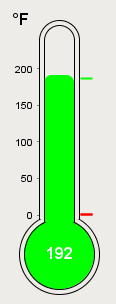
Property Name |
Value |
|
Units |
Fahrenheit |
|
Value |
192 |
|
Use Range Color |
True |
|
Interval 1 Low |
187 |
|
Interval 1 High |
212 |
|
Interval 2 Low |
0 |
|
Interval 2 High |
187 |
|
Interval 3 Low |
0 |
|
Interval 3 High |
187 |