Spinner
Component Palette Icon:

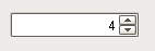
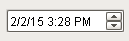
The spinner component represents a value that is part of a series of values, such as numbers and dates. It allows you to not only edit the value directly, but to 'spin' the value up or down, using the up and down buttons that are part of the component. When setting up property bindings, make sure you use the value property that corresponds to the spinner mode. For example, if you chose the Double spinner mode, you should bind the doubleValue property.
|
Name |
Description |
Property Type |
Scripting |
Category |
|
Antialias |
Draw with antialias on? Makes text smoother |
boolean |
.antialias |
Appearance |
|
Background Color |
The background color of the component. |
Color |
.background |
Appearance |
|
Border |
The border surrounding this component. NOTE that the border is unaffected by rotation. |
Border |
.border |
Common |
|
Data Quality |
The data quality code for any tag bindings on this component. |
int |
.dataQuality |
Data |
|
Date Format |
A date format pattern to use when the spinner is in date mode. |
String |
.dateFormat |
Appearance |
|
Date in Milliseconds |
The date in milliseconds from epoch time. (Read only. Usable in bindings and scripting.) |
long |
.dateInMillis |
Uncategorized |
|
Enabled |
If disabled, a component cannot be used. |
boolean |
.componentEnabled |
Common |
|
Font |
Font of text of this component |
Font |
.font |
Appearance |
|
Foreground Color |
The foreground color of the component. |
Color |
.foreground |
Appearance |
|
Mouseover Text |
The text that is displayed in the tooltip which pops up on mouseover of this component. |
String |
.toolTipText |
Common |
|
Name |
The name of this component. |
String |
.name |
Common |
|
Number Format |
A number format pattern to use when the spinner is in numeric mode. |
String |
.numberFormat |
Appearance |
|
Numeric Maximum |
The maximum value this spinner will accept when in 'Integer' or 'Double' mode. |
double |
.maxValue |
Data |
|
Numeric Minimum |
The minimum value this spinner will accept when in 'Integer' or 'Double' mode. |
double |
.minValue |
Data |
|
Numeric Step Size |
The size to step up or down when in 'Integer' or 'Double' mode. |
double |
.stepSize |
Behavior |
|
Spinner Mode |
The mode controls which data type this spinner accepts |
int |
.spinnerMode |
Behavior |
|
Styles |
Contains the component's styles |
Dataset |
.styles |
Appearance |
|
Touchscreen Mode |
Controls when this input component responds if touchscreen mode is enabled. |
int |
.touchscreenMode |
Behavior |
|
Value (Date) |
The current value if mode is 'Date' |
Date |
.dateValue |
Data |
|
Value (Double) |
The current value if mode is 'Double' |
double |
.doubleValue |
Data |
|
Value (Integer) |
The current value if mode is 'Integer' |
int |
.intValue |
Data |
|
Visible |
If disabled, the component will be hidden. |
boolean |
.visible |
Common |
This component does not have scripting functions associated with it.
This component does not have extension functions associated with it.
propertyChange
propertyChange
Fires whenever a bindable property of the source component changes. This works for standard and custom (dynamic) properties.
|
.source |
The component that fired this event. |
|
.newValue |
The new value that this property changed to. |
|
.oldValue |
The value that this property was before it changed. |
|
.propertyName |
The name of the property that changed. NOTE: remember to always filter out these events for the property that you are looking for! Components often have many properties that change. |
|
Property Name |
Value |
|
Spinner Mode |
Date |