Linear Scale
Component Palette Icon:
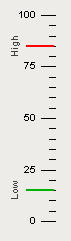
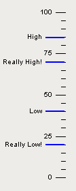
The linear scale component has two main purposes. The first is to display a series of tick marks and labels that visually represent a linear range between a minimum value and a maximum value. The second purpose is to display indicators that represent a value or range of values, correctly positioned in on the linear scale. In the example above, two linear scales are used to flank a level indicator. The scale on the left has only tick marks, and no indicators. The scale on the right is used to display three indicators and no tick marks.
To configure the indicators, you use the Linea Scale's "Scale Indicators" customizer. To configure the tick marks, you use the scale's various properties that determine the minimum value, maximum value, and the various tick mark spans.
|
Name |
Description |
Property Type |
Scripting |
Category |
|
Antialias |
Draw with antialias on? Makes text smoother |
boolean |
.antialias |
Appearance |
|
Border |
The border surrounding this component. NOTE that the border is unaffected by rotation. |
Border |
.border |
Common |
|
Cursor |
The mouse cursor to use when hovering over this component. |
int |
.cursorCode |
Common |
|
Data Quality |
The data quality code for any tag bindings on this component. |
int |
.dataQuality |
Data |
|
Fine Tick Color |
The line color for fine ticks. |
Color |
.fineTickColor |
Appearance |
|
Fine Tick Length |
The line length for fine ticks, in pixels. |
double |
.fineTickLength |
Appearance |
|
Fine Tick Span |
The span length for fine ticks. Should be a factor of the major and minor tick spans. Use zero to disable fine ticks. |
double |
.fineTickSpan |
Data |
|
Fine Tick Thickness |
The line thickness for fine ticks, in pixels |
float |
.fineTickStroke |
Appearance |
|
Indicators |
This dataset stores the indicators (if any) for the scale. |
Dataset |
.indicators |
Data |
|
Label Angle |
Changes the angle that the labels are drawn |
int |
.labelAngle |
Appearance |
|
Label Color |
The color used for drawing tick labels. |
Color |
.majorTickLabelColor |
Appearance |
|
Label Font |
The font used for drawing tick labels. |
Font |
.majorTickFont |
Appearance |
|
Label Format |
The label format string. Examples: "%.1f" will render numbers like "15.0", "%.0f" will render numbers like "15". Using the empty string "" will disable the labels. |
String |
.majorTickLabelFormat |
Appearance |
|
Major Tick Color |
The line color for major ticks. |
Color |
.majorTickColor |
Appearance |
|
Major Tick Length |
The line length for major ticks, in pixels. |
double |
.majorTickLength |
Appearance |
|
Major Tick Span |
The span length for major ticks. Should be a multiple of the minor and fine tick spans. |
double |
.majorTickSpan |
Data |
|
Major Tick Thickness |
The line thickness for major ticks, in pixels. |
float |
.majorTickStroke |
Appearance |
|
Margin |
The margin to leave blank as a percentage of the total height or width of the scale. |
double |
.margin |
Appearance |
|
Max Value |
The upper bound of the scale |
double |
.maxValue |
Data |
|
Min Value |
The lower bound of the scale |
double |
.minValue |
Data |
|
Minor Tick Color |
The line color for minor ticks. |
Color |
.minorTickColor |
Appearance |
|
Minor Tick Length |
The line length for minor ticks, in pixels. |
double |
.minorTickLength |
Appearance |
|
Minor Tick Span |
The span length for minor ticks. Should be a factor of the major tick span and a multiple of the fine tick spans. Use zero to disable minor ticks. |
double |
.minorTickSpan |
Data |
|
Minor Tick Thickness |
The line thickness for minor ticks, in pixels |
float |
.minorTickStroke |
Appearance |
|
Mirror |
Mirror the scale so it paints against the opposite edge. |
boolean |
.mirror |
Appearance |
|
Mouseover Text |
The text that is displayed in the tooltip which pops up on mouseover of this component. |
String |
.toolTipText |
Common |
|
Name |
The name of this component. |
String |
.name |
Common |
|
Reverse Range |
Reverse the scale so that values go from high to low instead of low to high. |
boolean |
.reverseRange |
Appearance |
|
Visible |
If disabled, the component will be hidden. |
boolean |
.visible |
Common |
This component does not have scripting functions associated with it.
This component does not have extension functions associated with it.
mouse
mouseClicked
This event signifies a mouse click on the source component. A mouse click the combination of a mouse press and a mouse release, both of which must have occurred over the source component. Note that this event fires after the pressed and released events have fired.
|
.source |
The component that fired this event |
|
.button |
The code for the button that caused this event to fire. |
|
.clickCount |
The number of mouse clicks associated with this event. |
|
.x |
The x-coordinate (with respect to the source component) of this mouse event. |
|
.y |
The y-coordinate (with respect to the source component) of this mouse event. |
|
.popupTrigger |
Returns True (1) if this mouse event is a popup trigger. What constitutes a popup trigger is operating system dependent, which is why this abstraction exists. |
|
.altDown |
True (1) if the Alt key was held down during this event, false (0) otherwise. |
|
.controlDown |
True (1) if the Control key was held down during this event, false (0) otherwise. |
|
.shiftDown |
True (1) if the Shift key was held down during this event, false (0) otherwise. |
mouseEntered
This event fires when the mouse enters the space over the source component.
|
.source |
The component that fired this event |
|
.button |
The code for the button that caused this event to fire. |
|
.clickCount |
The number of mouse clicks associated with this event. |
|
.x |
The x-coordinate (with respect to the source component) of this mouse event. |
|
.y |
The y-coordinate (with respect to the source component) of this mouse event. |
|
.popupTrigger |
Returns True (1) if this mouse event is a popup trigger. What constitutes a popup trigger is operating system dependent, which is why this abstraction exists. |
|
.altDown |
True (1) if the Alt key was held down during this event, false (0) otherwise. |
|
.controlDown |
True (1) if the Control key was held down during this event, false (0) otherwise. |
|
.shiftDown |
True (1) if the Shift key was held down during this event, false (0) otherwise. |
mouseExited
This event fires when the mouse leaves the space over the source component.
|
.source |
The component that fired this event |
|
.button |
The code for the button that caused this event to fire. |
|
.clickCount |
The number of mouse clicks associated with this event. |
|
.x |
The x-coordinate (with respect to the source component) of this mouse event. |
|
.y |
The y-coordinate (with respect to the source component) of this mouse event. |
|
.popupTrigger |
Returns True (1) if this mouse event is a popup trigger. What constitutes a popup trigger is operating system dependent, which is why this abstraction exists. |
|
.altDown |
True (1) if the Alt key was held down during this event, false (0) otherwise. |
|
.controlDown |
True (1) if the Control key was held down during this event, false (0) otherwise. |
|
.shiftDown |
True (1) if the Shift key was held down during this event, false (0) otherwise. |
mousePressed
This event fires when a mouse button is pressed down on the source component.
|
.source |
The component that fired this event |
|
.button |
The code for the button that caused this event to fire. |
|
.clickCount |
The number of mouse clicks associated with this event. |
|
.x |
The x-coordinate (with respect to the source component) of this mouse event. |
|
.y |
The y-coordinate (with respect to the source component) of this mouse event. |
|
.popupTrigger |
Returns True (1) if this mouse event is a popup trigger. What constitutes a popup trigger is operating system dependent, which is why this abstraction exists. |
|
.altDown |
True (1) if the Alt key was held down during this event, false (0) otherwise. |
|
.controlDown |
True (1) if the Control key was held down during this event, false (0) otherwise. |
|
.shiftDown |
True (1) if the Shift key was held down during this event, false (0) otherwise. |
mouseReleased
This event fires when a mouse button is released, if that mouse button's press happened over this component.
|
.source |
The component that fired this event |
|
.button |
The code for the button that caused this event to fire. |
|
.clickCount |
The number of mouse clicks associated with this event. |
|
.x |
The x-coordinate (with respect to the source component) of this mouse event. |
|
.y |
The y-coordinate (with respect to the source component) of this mouse event. |
|
.popupTrigger |
Returns True (1) if this mouse event is a popup trigger. What constitutes a popup trigger is operating system dependent, which is why this abstraction exists. |
|
.altDown |
True (1) if the Alt key was held down during this event, false (0) otherwise. |
|
.controlDown |
True (1) if the Control key was held down during this event, false (0) otherwise. |
|
.shiftDown |
True (1) if the Shift key was held down during this event, false (0) otherwise. |
mouseMotion
mouseDragged
Fires when the mouse moves over a component after a button has been pushed.
|
.source |
The component that fired this event |
|
.button |
The code for the button that caused this event to fire. |
|
.clickCount |
The number of mouse clicks associated with this event. |
|
.x |
The x-coordinate (with respect to the source component) of this mouse event. |
|
.y |
The y-coordinate (with respect to the source component) of this mouse event. |
|
.popupTrigger |
Returns True (1) if this mouse event is a popup trigger. What constitutes a popup trigger is operating system dependent, which is why this abstraction exists. |
|
.altDown |
True (1) if the Alt key was held down during this event, false (0) otherwise. |
|
.controlDown |
True (1) if the Control key was held down during this event, false (0) otherwise. |
|
.shiftDown |
True (1) if the Shift key was held down during this event, false (0) otherwise. |
mouseMoved
Fires when the mouse moves over a component, but no buttons are pushed.
|
.source |
The component that fired this event |
|
.button |
The code for the button that caused this event to fire. |
|
.clickCount |
The number of mouse clicks associated with this event. |
|
.x |
The x-coordinate (with respect to the source component) of this mouse event. |
|
.y |
The y-coordinate (with respect to the source component) of this mouse event. |
|
.popupTrigger |
Returns True (1) if this mouse event is a popup trigger. What constitutes a popup trigger is operating system dependent, which is why this abstraction exists. |
|
.altDown |
True (1) if the Alt key was held down during this event, false (0) otherwise. |
|
.controlDown |
True (1) if the Control key was held down during this event, false (0) otherwise. |
|
.shiftDown |
True (1) if the Shift key was held down during this event, false (0) otherwise. |
propertyChange
propertyChange
Fires whenever a bindable property of the source component changes. This works for standard and custom (dynamic) properties.
|
.source |
The component that fired this event |
|
.newValue |
The new value that this property changed to. |
|
.oldValue |
The value that this property was before it changed. Note that not all components include an accurate oldValue in their events. |
|
.propertyName |
The name of the property that changed. NOTE: remember to always filter out these events for the property that you are looking for! Components often have many properties that change. |
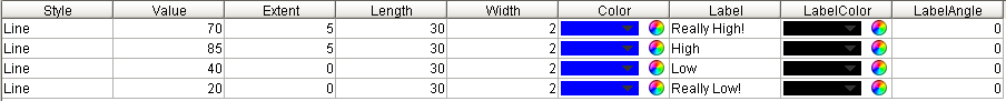
This component has a special customizer.
|
Property Name |
Value |
|
Indicators |
|