Sparkline Chart
Component Palette Icon:
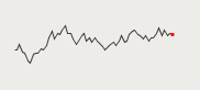
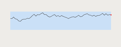
The sparkline chart is a minimalistic chart component that displays a line-chart history for a single datapoint. Sparklines were invented by Edward Tufte as a way to show a great deal of contextual information in a very small amount of space. Sparklines are typically used to display the recent history (up to current time) of a datapoint so that the viewer can quickly discern the recent trend of a datapoint: is it rising? falling? oscillating? etc..
To use a sparkline, bind its Data property either to a Tag Historian realtime query, or to a database query. There should be two columns in this dataset: the first one a date column, the second a number. Each row will become a datapoint on the chart, and the dataset must be sorted by time in ascending order.
Instead of using axes to convey scale, the sparkline can display a band of color across the back of the chart which indicates the desired operating range of the datapoint. In this way, it is instantly obvious when a value is in its expected range, above that range, or below. The sparkline automatically configures its internal axes based on the data given to it. To give it a fixed range, simply fill in the Range Highand Range Low properties.
|
Name |
Description |
Property Type |
Scripting |
Category |
|
Background Color |
The background color of the component. |
Color |
.background |
Appearance |
|
Border |
The border surrounding this component. NOTE that the border is unaffected by rotation. |
Border |
.border |
Common |
|
Border Inset |
The amount of space to inset the chart inside its border. |
double |
.borderInset |
Appearance |
|
Chart Max |
The value that corresponds to the upper edge of the chart. (Read only. Usable in bindings and scripting.) |
Double |
.chartMax |
Uncategorized |
|
Chart Min |
The value that corresponds to the lower edge of the chart. (Read only. Usable in bindings and scripting.) |
Double |
.chartMin |
Uncategorized |
|
Cursor |
The mouse cursor to use when hovering over this component. |
int |
.cursorCode |
Common |
|
Data |
The history data to draw in the sparkline chart. |
Dataset |
.data |
Data |
|
Data Quality |
The data quality code for any tag bindings on this component. |
int |
.dataQuality |
Data |
|
Desired High |
The high value of the desired operating range. If left blank (null), no desired range band will be shown. |
Double |
.desiredHi |
Data |
|
Desired Low |
The low value of the desired operating range. If left blank (null), no desired range band will be shown. |
Double |
.desiredLo |
Data |
|
Desired Range Color |
The color of the desired operating range band. Only used if the desired operating range is configured. |
Color |
.desiredRangeColor |
Appearance |
|
First Marker Color |
The color of the first value marker. |
Color |
.firstMarkerColor |
Markers |
|
First Marker Size |
The size of the first value marker. |
double |
.firstMarkerSize |
Markers |
|
First Marker Style |
The style of the first value marker. |
int |
.firstMarkerStyle |
Markers |
|
First Value |
The first (oldest) value in the dataset. (Read only. Usable in bindings and scripting.) |
Double |
.firstValue |
Uncategorized |
|
High Marker Color |
The color of the high value marker. |
Color |
.hiMarkerColor |
Markers |
|
High Marker Size |
The size of the high value marker. |
double |
.hiMarkerSize |
Markers |
|
High Marker Style |
The style of the high value marker. |
int |
.hiMarkerStyle |
Markers |
|
Last Marker Color |
The color of the last value marker. |
Color |
.lastMarkerColor |
Markers |
|
Last Marker Size |
The size of the last value marker. |
double |
.lastMarkerSize |
Markers |
|
Last Marker Style |
The style of the last value marker. |
int |
.lastMarkerStyle |
Markers |
|
Last Value |
The last (most recent) value in the dataset. (Read only. Usable in bindings and scripting.) |
Double |
.lastValue |
Uncategorized |
|
Line Color |
The color of the sparkline. |
Color |
.foreground |
Appearance |
|
Line Width |
The width of the sparkline. |
float |
.lineWidth |
Appearance |
|
Low Marker Color |
The color of the low value marker. |
Color |
.loMarkerColor |
Markers |
|
Low Marker Size |
The size of the low value marker. |
double |
.loMarkerSize |
Markers |
|
Low Marker Style |
The style of the low value marker. |
int |
.loMarkerStyle |
Markers |
|
Max Value |
The largest value in the dataset. (Read only. Usable in bindings and scripting.) |
Double |
.maxValue |
Uncategorized |
|
Min Value |
The smallest value in the dataset. (Read only. Usable in bindings and scripting.) |
Double |
.minValue |
Uncategorized |
|
Mouseover Text |
The text that is displayed in the tooltip which pops up on mouseover of this component. |
String |
.toolTipText |
Common |
|
Name |
The name of this component. |
String |
.name |
Common |
|
Range High |
A fixed value for the upper edge of the chart. If left blank (null), the upper range will be calculated automatically. |
Double |
.rangeHi |
Data |
|
Range Low |
A fixed value for the lower edge of the chart. If left blank (null), the lower range will be calculated automatically. |
Double |
.rangeLo |
Data |
|
Styles |
Contains the component's styles. |
Dataset |
.styles |
Appearance |
|
Visible |
If disabled, the component will be hidden. |
boolean |
.visible |
Common |
This component does not have scripting functions associated with it.
This component does not have extension functions associated with it.
mouse
mouseClicked
This event signifies a mouse click on the source component. A mouse click the combination of a mouse press and a mouse release, both of which must have occurred over the source component. Note that this event fires after the pressed and released events have fired.
|
.source |
The component that fired this event |
|
.button |
The code for the button that caused this event to fire. |
|
.clickCount |
The number of mouse clicks associated with this event. |
|
.x |
The x-coordinate (with respect to the source component) of this mouse event. |
|
.y |
The y-coordinate (with respect to the source component) of this mouse event. |
|
.popupTrigger |
Returns True (1) if this mouse event is a popup trigger. What constitutes a popup trigger is operating system dependent, which is why this abstraction exists. |
|
.altDown |
True (1) if the Alt key was held down during this event, false (0) otherwise. |
|
.controlDown |
True (1) if the Control key was held down during this event, false (0) otherwise. |
|
.shiftDown |
True (1) if the Shift key was held down during this event, false (0) otherwise. |
mouseEntered
This event fires when the mouse enters the space over the source component.
|
.source |
The component that fired this event |
|
.button |
The code for the button that caused this event to fire. |
|
.clickCount |
The number of mouse clicks associated with this event. |
|
.x |
The x-coordinate (with respect to the source component) of this mouse event. |
|
.y |
The y-coordinate (with respect to the source component) of this mouse event. |
|
.popupTrigger |
Returns True (1) if this mouse event is a popup trigger. What constitutes a popup trigger is operating system dependent, which is why this abstraction exists. |
|
.altDown |
True (1) if the Alt key was held down during this event, false (0) otherwise. |
|
.controlDown |
True (1) if the Control key was held down during this event, false (0) otherwise. |
|
.shiftDown |
True (1) if the Shift key was held down during this event, false (0) otherwise. |
mouseExited
This event fires when the mouse leaves the space over the source component.
|
.source |
The component that fired this event |
|
.button |
The code for the button that caused this event to fire. |
|
.clickCount |
The number of mouse clicks associated with this event. |
|
.x |
The x-coordinate (with respect to the source component) of this mouse event. |
|
.y |
The y-coordinate (with respect to the source component) of this mouse event. |
|
.popupTrigger |
Returns True (1) if this mouse event is a popup trigger. What constitutes a popup trigger is operating system dependent, which is why this abstraction exists. |
|
.altDown |
True (1) if the Alt key was held down during this event, false (0) otherwise. |
|
.controlDown |
True (1) if the Control key was held down during this event, false (0) otherwise. |
|
.shiftDown |
True (1) if the Shift key was held down during this event, false (0) otherwise. |
mousePressed
This event fires when a mouse button is pressed down on the source component.
|
.source |
The component that fired this event |
|
.button |
The code for the button that caused this event to fire. |
|
.clickCount |
The number of mouse clicks associated with this event. |
|
.x |
The x-coordinate (with respect to the source component) of this mouse event. |
|
.y |
The y-coordinate (with respect to the source component) of this mouse event. |
|
.popupTrigger |
Returns True (1) if this mouse event is a popup trigger. What constitutes a popup trigger is operating system dependent, which is why this abstraction exists. |
|
.altDown |
True (1) if the Alt key was held down during this event, false (0) otherwise. |
|
.controlDown |
True (1) if the Control key was held down during this event, false (0) otherwise. |
|
.shiftDown |
True (1) if the Shift key was held down during this event, false (0) otherwise. |
mouseReleased
This event fires when a mouse button is released, if that mouse button's press happened over this component.
|
.source |
The component that fired this event |
|
.button |
The code for the button that caused this event to fire. |
|
.clickCount |
The number of mouse clicks associated with this event. |
|
.x |
The x-coordinate (with respect to the source component) of this mouse event. |
|
.y |
The y-coordinate (with respect to the source component) of this mouse event. |
|
.popupTrigger |
Returns True (1) if this mouse event is a popup trigger. What constitutes a popup trigger is operating system dependent, which is why this abstraction exists. |
|
.altDown |
True (1) if the Alt key was held down during this event, false (0) otherwise. |
|
.controlDown |
True (1) if the Control key was held down during this event, false (0) otherwise. |
|
.shiftDown |
True (1) if the Shift key was held down during this event, false (0) otherwise. |
mouseMotion
mouseDragged
Fires when the mouse moves over a component after a button has been pushed.
|
.source |
The component that fired this event |
|
.button |
The code for the button that caused this event to fire. |
|
.clickCount |
The number of mouse clicks associated with this event. |
|
.x |
The x-coordinate (with respect to the source component) of this mouse event. |
|
.y |
The y-coordinate (with respect to the source component) of this mouse event. |
|
.popupTrigger |
Returns True (1) if this mouse event is a popup trigger. What constitutes a popup trigger is operating system dependent, which is why this abstraction exists. |
|
.altDown |
True (1) if the Alt key was held down during this event, false (0) otherwise. |
|
.controlDown |
True (1) if the Control key was held down during this event, false (0) otherwise. |
|
.shiftDown |
True (1) if the Shift key was held down during this event, false (0) otherwise. |
mouseMoved
Fires when the mouse moves over a component, but no buttons are pushed.
|
.source |
The component that fired this event |
|
.button |
The code for the button that caused this event to fire. |
|
.clickCount |
The number of mouse clicks associated with this event. |
|
.x |
The x-coordinate (with respect to the source component) of this mouse event. |
|
.y |
The y-coordinate (with respect to the source component) of this mouse event. |
|
.popupTrigger |
Returns True (1) if this mouse event is a popup trigger. What constitutes a popup trigger is operating system dependent, which is why this abstraction exists. |
|
.altDown |
True (1) if the Alt key was held down during this event, false (0) otherwise. |
|
.controlDown |
True (1) if the Control key was held down during this event, false (0) otherwise. |
|
.shiftDown |
True (1) if the Shift key was held down during this event, false (0) otherwise. |
propertyChange
propertyChange
Fires whenever a bindable property of the source component changes. This works for standard and custom (dynamic) properties.
|
.source |
The component that fired this event |
|
.newValue |
The new value that this property changed to. |
|
.oldValue |
The value that this property was before it changed. Note that not all components include an accurate oldValue in their events. |
|
.propertyName |
The name of the property that changed. NOTE: remember to always filter out these events for the property that you are looking for! Components often have many properties that change. |
This component does not have any custom properties.
|
Property Name |
Value |
|
Range High |
100 |
|
Range Low |
0 |
|
Desired High |
75 |
|
Desired Low |
40 |