Custom Input Template
Sometimes you may need to have text fields in your project for the user to input data. Rather than copying and pasting these text fields into each window, you can create a template for them that includes a label and a text field. A template can contain scripting to validate the data in the text field.
To create a custom input template
-
In the Project Browser, right-click Templates and select New Template.
-
Right-click on New Template and click Rename to change its name it to something, lets say Text Entry.
-
To add a parameter, right-click the checkered area and select Customizers > Custom Properties.
-
In the Custom Properties window, add two Template Parameters by clicking the + icon twice and entering the following:
1st Parameter
Name: display
Type: String
2nd Parameter
Name: text
Type: String -
Click OK.
-
From the Component Palette, drag a Text Field and a Label to the checkered area of the template, resizing so that the label and the text box occupy the majority of the space.
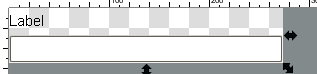
-
Select the Label component, go to Property Editor, and click on the binding icon of the Text property. The Property Binding window is displayed.
-
In the Property Binding window, click on Property, choose the display property. Make sure the Bidirectional Box is not selected, and click OK.
Don't worry if the label on the template disappears. Its is simply displaying the value of the display custom property which is currently blank. -
Now select the Text Field component, go to Property Editor, and click on the binding icon of the Text property.
-
In the Property Binding window, click on Property, choose the text property. Make sure the Bidirectional Box is selected, and click OK.
Suppose you want data validation on the Text Field. We can have the background color of the Text Field change depending on whether the user has entered a text value or not. We can set the field to red when its empty, and white when it has a value.-
While the Text Field component is still selected, go to Property Editor, and click on the binding icon of the Background property.
-
In the Property Binding window, click on Expression, enter the following expression:
//Inside the if statement is the len and the trim functions that are availible when doing expression bindings.//The trim function will trim the blank spaces from the text therefore validating that there is actual text rather than spaces.//The len function will count the lenth of the recently trimmed text.//The if statements asks the question: Is the length of the trimmed text greater than zero?if(len(trim({textBox.Text Field.text}))>0,color(255,255,255),color(255,0,0)) -
Click OK.
-
-
Close the template, click Save on the prompt window, and click OK.
-
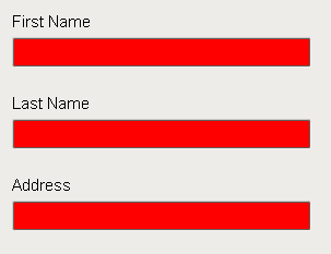
To set data validation, drag a few the Text Entry templates from Project Browser to the screen/window. Notice that the text field is red.
-
In the Property Editor, go to the display custom property and enter something like First Name. Do something similar for the other templates. Notice how the label gets filled in with the data we enter.
-
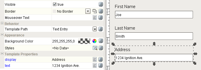
Put the designer into Preview Mode, and enter in some values into the text fields. Notice that the background color changed to white, and the information that was entered is now in the text property that can be bidirectionally bound so that it writes to a tag or is used in a script.
Similar Topics ...