Radar Chart Component
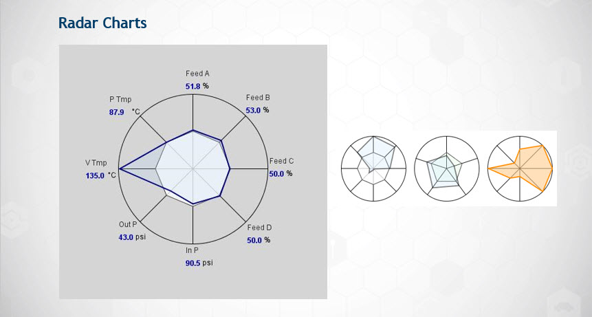
Another high performance HMI technique is using the Radar Chart. Radar Charts (also know as, spider charts or spider plots) are useful for displaying several values at once. Each value is plotted on a separate axis. The chart draws a line between the different values, which create a shape that changes as those values change. Inside the chart, there is a circle that represents what the chart would look like if all of its values were in their ideal range. So the chart lets you quickly see where the values are in comparison to where they should ideally be.
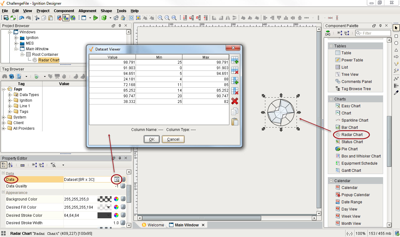
To use the Radar Chart component
-
In the Designer, drag the Radar Chart from the Charts tab of the Component Palette to your workspace.
-
Click on the Dataset Viewer icon for the Data property in Property Editor to set the values.
For eac h value you enter, an axis is created. For example, you can see below that there are 8 values in the Dataset Viewer which corresponds to the 8 axis on the Radar Chart. The Min and the Max represent the acceptable limits of the Value.
You can show live tag values on the Radar Chart by binding the Data property to the Cell Update binding type. For example, suppose you had a group of motors. Each motor had a value for is current amps, a minimum number of amps, and a maximum number of amps. A Cell Update binding can represent each motor. The value, min, and max columns of the Radar Chart's dataset can be bound to each motors value, minimum, and maximum amps. The result is that different motors with different thresholds of tolerance can be visually represented on the Radar Chart.
Next...