Sparkline Chart Component
The sparkline chart is a minimalistic chart component that displays a line-chart history for a single datapoint also known as trends. Sparkline or trend charts were invented as a way to show a great deal of contextual information in a very small amount of space.
To use the sparkline chart component
-
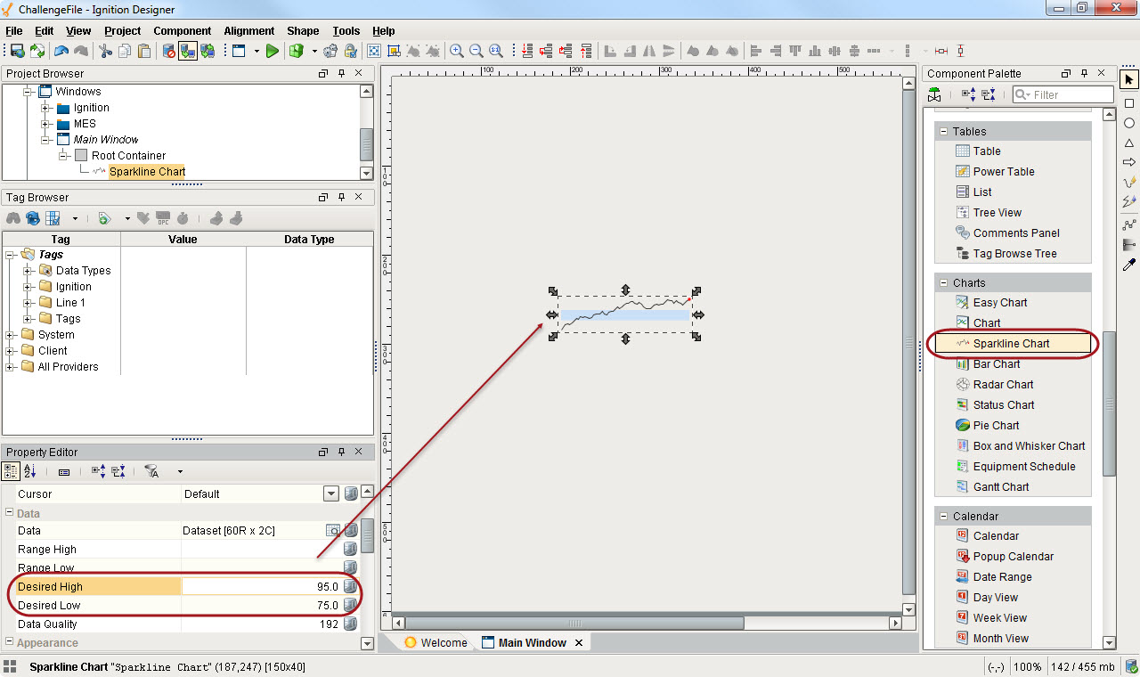
In the Designer, drag the Sparkline Chart from the Charts tab of the Component Palette to your workspace.
-
Use the properties in Property Editor to set the different range values.
For example, you can use the Desired High and Desired Low properties to set the normal ranges in a blue color, as shown below.
The red dot on the Sparkline chart represents the most latest value.