Meter
Component Palette Icon:
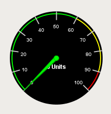
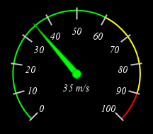
A meter display shows a value on a needle-gauge. The gauge's range can be broken up into five intervals. The intervals can have their own edge and background colors.How the meter looks is affected by its appearance properties.
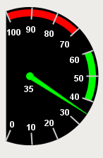
You can modify colors, thicknesses, start and extend angles, needle size, etc to get the meter that you want. For example, the meter on the far right of the example has a Meter Angle Extent of 90°, a Meter Angle of 45°, a reversed range, and 2 intervals.
|
Name |
Description |
Property Type |
Scripting |
Category |
|
Arc Width |
The width of the colored interval arcs |
float |
.arcWidth |
Appearance |
|
Border |
The border surrounding this component. NOTE that the border is unaffected by rotation. |
Border |
.border |
Common |
|
Cursor |
The mouse cursor to use when hovering over this component. |
int |
.cursorCode |
Common |
|
Data Quality |
The data quality code for any tag bindings on this component. |
int |
.dataQuality |
Data |
|
Dial Background |
The background color of the dial face. |
Color |
.dialBackground |
Appearance |
|
Dial Shape |
The shape of the dial. This property determines how the dial face looks in the area not covered by the meter angle extent. |
int |
.dialType |
Appearance |
|
Interval 1 Background |
The color to fill the wedge of this interval. |
Color |
.interval1Background |
Intervals |
|
Interval 1 High |
The upper bound of this interval. |
double |
.interval1High |
Intervals |
|
Interval 1 Low |
The lower bound of this interval. |
double |
.interval1Low |
Intervals |
|
Interval 1 Outline |
The color to paint the arc of this interval. |
Color |
.interval1Outline |
Intervals |
|
Interval 2 Background |
The color to fill the wedge of this interval. |
Color |
.interval2Background |
Intervals |
|
Interval 2 High |
The upper bound of this interval. |
double |
.interval2High |
Intervals |
|
Interval 2 Low |
The lower bound of this interval. |
double |
.interval2Low |
Intervals |
|
Interval 2 Outline |
The color to paint the arc of this interval. |
Color |
.interval2Outline |
Intervals |
|
Interval 3 Background |
The color to fill the wedge of this interval. |
Color |
.interval3Background |
Intervals |
|
Interval 3 High |
The upper bound of this interval. |
double |
.interval3High |
Intervals |
|
Interval 3 Low |
The lower bound of this interval. |
double |
.interval3Low |
Intervals |
|
Interval 3 Outline |
The color to paint the arc of this interval. |
Color |
.interval3Outline |
Intervals |
|
Interval 4 Background |
The color to fill the wedge of this interval. |
Color |
.interval4Background |
Intervals |
|
Interval 4 High |
The upper bound of this interval. |
double |
.interval4High |
Intervals |
|
Interval 4 Low |
The lower bound of this interval. |
double |
.interval4Low |
Intervals |
|
Interval 4 Outline |
The color to paint the arc of this interval. |
Color |
.interval4Outline |
Intervals |
|
Interval 5 Background |
The color to fill the wedge of this interval. |
Color |
.interval5Background |
Intervals |
|
Interval 5 High |
The upper bound of this interval. |
double |
.interval5High |
Intervals |
|
Interval 5 Low |
The lower bound of this interval. |
double |
.interval5Low |
Intervals |
|
Interval 5 Outline |
The color to paint the arc of this interval. |
Color |
.interval5Outline |
Intervals |
|
Meter Angle |
The angle in degrees of the centerpoint of the meter (90 is straight up). |
int |
.meterAngle |
Appearance |
|
Meter Angle Extent |
The extent, in degrees, of the entire meter. |
int |
.meterAngleExtent |
Appearance |
|
Mouseover Text |
The text that is displayed in the tooltip which pops up on mouseover of this component. |
String |
.toolTipText |
Common |
|
Name |
The name of this component. |
String |
.name |
Common |
|
Needle Color |
The color of the meter's needle. |
Color |
.needleColor |
Appearance |
|
Needle Size |
The size of the base of the needle. |
float |
.needleSize |
Appearance |
|
Needle Stroke Color |
The color of the needle's stroke. |
Color |
.needleStrokeColor |
Appearance |
|
Needle Stroke Size |
The size of the needle's stroke. |
float |
.needleStrokeSize |
Appearance |
|
Overall High Bound |
The high bound for the whole meter |
double |
.overallHigh |
Data |
|
Overall Low Bound |
The lower bound for the whole meter |
double |
.overallLow |
Data |
|
Reverse Range? |
If true, the meter will consider right to left needle movement as positive. |
boolean |
.reverseRange |
Data |
|
Show Tick Labels? |
If true, value will be shown on interval-boundary ticks. |
boolean |
.ticks |
Appearance |
|
Styles |
Contains the component's styles |
Dataset |
.styles |
Appearance |
|
Tick Color |
The color of tick marks. |
Color |
.tickColor |
Appearance |
|
Tick Format |
The number format to use for the tick labels. |
String |
.tickLabelFormat |
Appearance |
|
Tick Label Color |
The color of the tick labels |
Color |
.tickLabelColor |
Appearance |
|
Tick Label Font |
The font to use for the tick labels. |
Font |
.labelFont |
Appearance |
|
Tick Size |
The distance between ticks. |
double |
.tickSize |
Appearance |
|
Units |
A string to describe the units for the current value label. |
String |
.units |
Appearance |
|
Value |
The value to display in this meter. The needle and current value label will change to reflect this. |
double |
.value |
Data |
|
Value Color |
The color of the meter's current value label. |
Color |
.valueColor |
Appearance |
|
Value Format |
The number format to use for the value label. |
String |
.valueLabelFormat |
Appearance |
|
Value Label Font |
The font to use for the current value label. |
Font |
.valueFont |
Appearance |
|
Visible |
If disabled, the component will be hidden. |
boolean |
.visible |
Common |
This component does not have scripting functions associated with it.
This component does not have extension functions associated with it.
mouse
mouseClicked
This event signifies a mouse click on the source component. A mouse click the combination of a mouse press and a mouse release, both of which must have occurred over the source component. Note that this event fires after the pressed and released events have fired.
|
.source |
The component that fired this event |
|
.button |
The code for the button that caused this event to fire. |
|
.clickCount |
The number of mouse clicks associated with this event. |
|
.x |
The x-coordinate (with respect to the source component) of this mouse event. |
|
.y |
The y-coordinate (with respect to the source component) of this mouse event. |
|
.popupTrigger |
Returns True (1) if this mouse event is a popup trigger. What constitutes a popup trigger is operating system dependent, which is why this abstraction exists. |
|
.altDown |
True (1) if the Alt key was held down during this event, false (0) otherwise. |
|
.controlDown |
True (1) if the Control key was held down during this event, false (0) otherwise. |
|
.shiftDown |
True (1) if the Shift key was held down during this event, false (0) otherwise. |
mouseEntered
This event fires when the mouse enters the space over the source component.
|
.source |
The component that fired this event |
|
.button |
The code for the button that caused this event to fire. |
|
.clickCount |
The number of mouse clicks associated with this event. |
|
.x |
The x-coordinate (with respect to the source component) of this mouse event. |
|
.y |
The y-coordinate (with respect to the source component) of this mouse event. |
|
.popupTrigger |
Returns True (1) if this mouse event is a popup trigger. What constitutes a popup trigger is operating system dependent, which is why this abstraction exists. |
|
.altDown |
True (1) if the Alt key was held down during this event, false (0) otherwise. |
|
.controlDown |
True (1) if the Control key was held down during this event, false (0) otherwise. |
|
.shiftDown |
True (1) if the Shift key was held down during this event, false (0) otherwise. |
mouseExited
This event fires when the mouse leaves the space over the source component.
|
.source |
The component that fired this event |
|
.button |
The code for the button that caused this event to fire. |
|
.clickCount |
The number of mouse clicks associated with this event. |
|
.x |
The x-coordinate (with respect to the source component) of this mouse event. |
|
.y |
The y-coordinate (with respect to the source component) of this mouse event. |
|
.popupTrigger |
Returns True (1) if this mouse event is a popup trigger. What constitutes a popup trigger is operating system dependent, which is why this abstraction exists. |
|
.altDown |
True (1) if the Alt key was held down during this event, false (0) otherwise. |
|
.controlDown |
True (1) if the Control key was held down during this event, false (0) otherwise. |
|
.shiftDown |
True (1) if the Shift key was held down during this event, false (0) otherwise. |
mousePressed
This event fires when a mouse button is pressed down on the source component.
|
.source |
The component that fired this event |
|
.button |
The code for the button that caused this event to fire. |
|
.clickCount |
The number of mouse clicks associated with this event. |
|
.x |
The x-coordinate (with respect to the source component) of this mouse event. |
|
.y |
The y-coordinate (with respect to the source component) of this mouse event. |
|
.popupTrigger |
Returns True (1) if this mouse event is a popup trigger. What constitutes a popup trigger is operating system dependent, which is why this abstraction exists. |
|
.altDown |
True (1) if the Alt key was held down during this event, false (0) otherwise. |
|
.controlDown |
True (1) if the Control key was held down during this event, false (0) otherwise. |
|
.shiftDown |
True (1) if the Shift key was held down during this event, false (0) otherwise. |
mouseReleased
This event fires when a mouse button is released, if that mouse button's press happened over this component.
|
.source |
The component that fired this event |
|
.button |
The code for the button that caused this event to fire. |
|
.clickCount |
The number of mouse clicks associated with this event. |
|
.x |
The x-coordinate (with respect to the source component) of this mouse event. |
|
.y |
The y-coordinate (with respect to the source component) of this mouse event. |
|
.popupTrigger |
Returns True (1) if this mouse event is a popup trigger. What constitutes a popup trigger is operating system dependent, which is why this abstraction exists. |
|
.altDown |
True (1) if the Alt key was held down during this event, false (0) otherwise. |
|
.controlDown |
True (1) if the Control key was held down during this event, false (0) otherwise. |
|
.shiftDown |
True (1) if the Shift key was held down during this event, false (0) otherwise. |
mouseMotion
mouseDragged
Fires when the mouse moves over a component after a button has been pushed.
|
.source |
The component that fired this event |
|
.button |
The code for the button that caused this event to fire. |
|
.clickCount |
The number of mouse clicks associated with this event. |
|
.x |
The x-coordinate (with respect to the source component) of this mouse event. |
|
.y |
The y-coordinate (with respect to the source component) of this mouse event. |
|
.popupTrigger |
Returns True (1) if this mouse event is a popup trigger. What constitutes a popup trigger is operating system dependent, which is why this abstraction exists. |
|
.altDown |
True (1) if the Alt key was held down during this event, false (0) otherwise. |
|
.controlDown |
True (1) if the Control key was held down during this event, false (0) otherwise. |
|
.shiftDown |
True (1) if the Shift key was held down during this event, false (0) otherwise. |
mouseMoved
Fires when the mouse moves over a component, but no buttons are pushed.
|
.source |
The component that fired this event |
|
.button |
The code for the button that caused this event to fire. |
|
.clickCount |
The number of mouse clicks associated with this event. |
|
.x |
The x-coordinate (with respect to the source component) of this mouse event. |
|
.y |
The y-coordinate (with respect to the source component) of this mouse event. |
|
.popupTrigger |
Returns True (1) if this mouse event is a popup trigger. What constitutes a popup trigger is operating system dependent, which is why this abstraction exists. |
|
.altDown |
True (1) if the Alt key was held down during this event, false (0) otherwise. |
|
.controlDown |
True (1) if the Control key was held down during this event, false (0) otherwise. |
|
.shiftDown |
True (1) if the Shift key was held down during this event, false (0) otherwise. |
propertyChange
propertyChange
Fires whenever a bindable property of the source component changes. This works for standard and custom (dynamic) properties.
|
.source |
The component that fired this event |
|
.newValue |
The new value that this property changed to. |
|
.oldValue |
The value that this property was before it changed. Note that not all components include an accurate oldValue in their events. |
|
.propertyName |
The name of the property that changed. NOTE: remember to always filter out these events for the property that you are looking for! Components often have many properties that change. |
|
Property Name |
Value |
|
Value |
35 |
|
Unit |
m/s |
|
Value Label Font |
Vijaya, Bold, 15 |
|
Tick Label Font |
Vijaya, Bold, 15 |
|
Property Name |
Value |
|
Value |
35 |
|
Reverse Range? |
True |
|
Units |
'None' |
|
Arc Width |
10 |
|
Meter Angle Extent |
220 |
|
Meter Angle |
0 |
|
Dial Shape |
Chord |
|
Interval 1 Low |
40 |
|
Interval 2 High |
60 |
|
Interval 3 Low |
70 |