Power Table
Component Palette Icon:
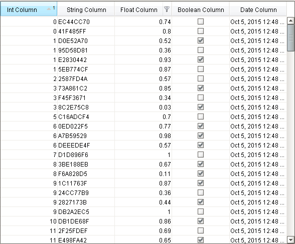
The power table is a much more customizable version of the table component, and has many more features. The power table contains advanced features such as drag-and-drop rows, multi-column sorting, column filtering, and cell-spanning. Customization comes through extensive use of extension functions , which are available to configure how each cell of the table looks, how the headers look, etc.
Basic Usage
The basics are just like the classic table - you simply bind the table's "data" property to your data, most often by using a SQL query binding. Note that many of the options built into the classic table have been moved to extension functions in the power table.
Power Table Features
-
Multi-column sorting. To sort multiple columns, select the header of the first column, hold down the Control key, then select the header of the next column. Click on the header again to reverse the sort order, and click a third time to remove sorting on the column.
-
Column filtering. Columns can be temporarily hidden from view using column filtering. Right-click on the header of the table, and uncheck columns that you would like to hide. You can disable this feature by disabling the Column Chooser Menu property on the table.
-
Column reordering. You can switch the locations of columns on the table using column reordering. Drag the header of the column that you would like to move to a new location on the table. You can disable this feature by disabling the Columns Re-Orderable property on the table.
-
Cell spanning. A cell can be spanned across multiple columns and rows. Keep in mind that you must explicitly define the locations of cells that must be spanned. This means that if you would like to use cell spanning, any other table features that change how the table is displayed will be disabled automatically (such as sorting, column filtering and column reordering). Click on the Cell Span Data dataset to configure spanning. Within the dataset, add a row for each new span. The "row" column controls the row in the table where the span will start. The "column" column controls the column where the span will start. The "width" column controls how many columns the span will cover. The "height" column controls how many rows the span will cover. Adding a row where "row=4, column=1, width=2, height=3" results in a span starting on the fifth row of the table and the second column (using 0-based indexing). The span will cover the second and third columns in the row and will also cover two rows below the fifth row, as shown below.
-
Drag and Drop. This feature allows you to drag rows from one power table to another power table. In order to perform drag and drop, you must implement the onRowsDropped() extension function on the destination table. This is so that you can adapt the data from one table to the other within the function. You must also enable the Row Dragging Enabled property on both tables.
|
Name |
Description |
Property Type |
Scripting |
Category |
|
Antialias |
Draw with antialias on? Makes text smoother |
boolean |
.antialias |
Appearance |
|
Auto Row Height |
Enables automatic resizing of row height. |
boolean |
.rowResizeEnabled |
Behavior |
|
Auto-Resize Mode |
Determines how the table resizes the columns |
int |
.autoResizeMode |
Behavior |
|
Background Color |
The background color of the component. |
Color |
.background |
Appearance |
|
Cell Span Data |
This dataset holds information about how cells in the table span multiple rows and/or columns. Incompatible with column sorting and re-ordering. |
Dataset |
.cellSpanData |
Data |
|
Column Attributes Data |
The dataset describing the column attributes. |
Dataset |
.columnAttributesData |
Appearance |
|
Column Chooser Menu |
Enables a right-click popup menu on the column headers with options to show and hide columns. |
boolean |
.headerColumnChooserMenus |
Behavior |
|
Column Resize Menu |
Enables a right-click popup menu on the column headers with resizing options. |
boolean |
.headerResizeMenus |
Behavior |
|
Column Selection Allowed |
This flag is used in conjunction with the Row Selection Allowed flag to determine whether not whole-rows, whole-columns, or both (single-cells) are selectable. |
boolean |
.columnSelectionAllowed |
Behavior |
|
Column Sizing |
Represents column sizing and position to preserve user-selected ordering. |
String |
.defaultColumnView |
Appearance |
|
Columns Re-Orderable |
Enables the re-ordering of columns by dragging the column headers |
boolean |
.columnReorderingAllowed |
Behavior |
|
Columns Resizable |
Enables the resizing of columns by dragging the margins of the column headers |
boolean |
.columnResizingAllowed |
Behavior |
|
Cursor |
The mouse cursor to use when hovering over this component. |
int |
.cursorCode |
Common |
|
Data |
The data for this table |
Dataset |
.data |
Data |
|
Data Quality |
The data quality code for any tag bindings on this component. |
int |
.dataQuality |
Data |
|
Edit Click Count |
The number of clicks required to start editing a cell. |
int |
.clickCountToStart |
Behavior |
|
Enabled |
If disabled, a component cannot be used. |
boolean |
.componentEnabled |
Common |
|
Font |
Font of text of this component |
Font |
.font |
Appearance |
|
Foreground Color |
The foreground color of the component. |
Color |
.foreground |
Appearance |
|
Grid Line Color |
The color used to draw grid lines. |
Color |
.gridColor |
Appearance |
|
Header Font |
Font of the table's header text |
Font |
.headerFont |
Appearance |
|
Header Visible |
Allows for hiding of the table's header. |
boolean |
.headerVisible |
Appearance |
|
Inter Cell Spacing |
The space (in pixels) between the cells |
Dimension |
.interCellSpacing |
Appearance |
|
Name |
The name of this component. |
String |
.name |
Common |
|
Non-Contiguous Selection |
Enables totally non-contiguous selection in the table |
boolean |
.nonContiguousCellSelection |
Behavior |
|
Properties Loading |
The number of properties currently being loaded. (Read only. Usable in bindings and scripting.) |
int |
.propertiesLoading |
Uncategorized |
|
Row Dragging Enabled |
Enables drag-and-drop re-ordering for table rows. Implementing the 'onRowsDropped' extension function is also required to have functional drag-and-drop. |
boolean |
.rowDragEnabled |
Behavior |
|
Row Height |
If row resizing is disabled, this will set the height of all rows |
int |
.rowHeight |
Behavior |
|
Row Selection Allowed |
This flag is used in conjunction with the Column Selection Allowed flag to determine whether not whole-rows, whole-columns, or both (single-cells) are selectable. |
boolean |
.rowSelectionAllowed |
Behavior |
|
Selected Column |
The index of the first selected column, or -1 if none. |
int |
.selectedColumn |
Data |
|
Selected Row |
The index of the first selected row, or -1 if none. |
int |
.selectedRow |
Data |
|
Selection Background |
The default background color of selected cells. |
Color |
.selectionBackground |
Appearance |
|
Selection Foreground |
The default foreground color of selected cells. |
Color |
.selectionForeground |
Appearance |
|
Selection Mode |
This mode determines if only one row/cell/column can be selected at once, or single or multiple intervals |
int |
.selectionMode |
Behavior |
|
Show Horizontal Grid Lines? |
Shows horizontal grid lines. |
boolean |
.showHorizontalLines |
Appearance |
|
Show Vertical Grid Lines? |
Shows vertical grid lines. |
boolean |
.showVerticalLines |
Appearance |
|
Sorting Enabled |
Enables automatic multi-column sorting by clicking and CTRL-clicking on the table header. |
boolean |
.sortingEnabled |
Behavior |
|
TestData |
Toggle this property to fill in the table's data with random data. |
boolean |
.test |
Misc |
|
View Dataset |
A read-only copy of the data as it appears on screen in the table. |
Dataset |
.viewDataset |
Data |
|
Visible |
If disabled, the component will be hidden. |
boolean |
.visible |
Common |
.getSelectedColumns()
-
Description
Returns a list of ints representing the currently selected columns.
-
Parameters
none
-
Return
List of Integers
-
Scope
Client
.getSelectedRows()
-
Description
Returns a list of ints representing the currently selected rows.
-
Parameters
none
-
Return
List of Integers
-
Scope
Client
.print([fitWidth] [, headerFormat] [, footerFormat] [, showDialog] [, landscape])
-
Description
This specialized print function will paginate the table onto multiple pages.This function accepts keyword-style invocation.
-
Keyword Args
boolean fitWidth - If true, the table's width will be stretched to fit across one page's width. Rows will still paginate normally. If false, the table will paginate columns onto extra pages. (default = true) [optional]
String headerFormat - A string to use as the table's page header. The substring "{0}" will be replaced with the current page number. (default = None) [optional]
String footerFormat - A string to use as the table's page footer. The substring "{0}" will be replaced with the current page number. (default = "Page {0}") [optional]
boolean showDialog - Used to determine if the print dialog should be shown to the user. Default is true. [optional]
boolean landscape - Used to specify portrait (0) or landscape (1) mode. Default is portrait (0). [optional]
-
Return
boolean - True if the print job was successful.
-
Scope
Client
.setColumnWidth(column, width)
-
Description
Used to set a column's width at runtime.
-
Parameters
int c olumn - Column to adjust.
int width - Width in pixels.
-
Return
Nothing
-
Scope
Client
configureCell
-
Description
Provides a chance to configure the contents of each cell. Returns a dictionary of name-value pairs with the desired attributes. Available attributes (and their Java types) include: 'background' (color), 'border' (border), 'font' (font), 'foreground' (color), 'horizontalAlignment' (int), 'iconPath' (string), 'text' (string), 'toolTipText' (string), 'verticalAlignment' (int).
You can alaso specify the attribute 'renderer', which is expected to be a javax.swing.JComponent which will be used to render the cell.
-
Parameters
Component self - A reference to the component that is invoking this function.
Object value - The value in the dataset at this cell.
string textValue - The text the table expects to display at this cell (may be overriden by including 'text' attribute returned in dictionary).
boolean selected - A boolean indicating whether this cell is currently selected.
int rowIndex - The index of the row in the underlying dataset
int colIndex - The index of the column in the underlying dataset
string colName - The name of the column in the underlying dataset
int rowView - The index of the row, as it appears in the table view (affected by sorting)
int colView - The index of the column, as it appears in the table view (affected by column re-arranging and hiding)
-
Return
Dictionary of Attributes
-
Scope
Client
configureEditor
-
Description
Provides a change to configure how each column is edited. Returns a dictionary of name-value pairs with desired editor attributes. Visual attributes to modify existing editors include: 'background', 'border', 'font', 'foreground', 'horizontalAlignment', 'toolTipText', and 'verticalAlignment'
If the attribure 'options' is specified, it is expected to be a list of tuples representing (value, label). The editor in this case will become a dropdown list.
If the attribute 'editor' is specified, it is expected to be an instance of javax.swing.table.TableCellEditor, and other attribute will be ignored.
-
Parameters
Component self - A reference to the component that is invoking this function
int colIndex - The index of the column in the underlying dataset
string colName - The name of the column in the underlying dataset
-
Return
Dictionary of name value pairs
-
Scope
Client
configureHeaderStyle
-
Description
Provides a chance to configure the style of each column header. Return a dictionary of name-value pairs with the designed attributes. Availible attributes include: 'background', 'border', 'font', 'foreground', 'horizontalAlignment', 'toolTipText', 'verticalAlignment'
-
Parameters
Component self - A reference to the component that is invoking this function
int colIndex - The index of the column in the underlying dataset
string colName - The name of the column in the underlying dataset
-
Return
Dictionary of name value pairs
-
Scope
Client
initialize
-
Description
Called when the window containing this table is opened, or the template containing it is loaded. Provides a change to initialize the table further, for example, selecting a specific row.
-
Parameters
Component self - A reference to the component that is invoking this function
-
Return
Nothing
-
Scope
Client
isCellEditable
-
Description
Returns a boolean that determines whether or not the current cell is editable.
-
Parameters
Component self - A reference to the component that is invoking this function.
int rowIndex - Index of the row that was edited, relative to the underlying dataset.
int colIndex - Index of the column that was edited, relative to the underlying dataset.
string colName - Name of the column in the underlying dataset.
Object value - The value at the cell location.
-
Return
boolean
-
Scope
Client
onCellEdited
-
Description
Called when the user has edited a cell in the table. It is up to the implementation of this function to alter the underlying data that drives the table. This might mean altering the dataset directly, or running a SQL UPDATE query to update data in the database.
-
Parameters
Component self - A reference to the component that is invoking this function.
int rowIndex - Index of the row that was edited, relative to the underlying dataset.
int colIndex - Index of the column that was edited, relative to the underlying dataset.
string colName - Name of the column in the underlying dataset.
Object oldValue - The old value at the location, before it was edited.
Object newValue - The new value input by the user.
-
Return
Nothing
-
Scope
Client
onMousePress
-
Description
Called when the user clicks on a table cell.
-
Parameters
Component self - A reference to the component that is invoking this function.
int rowIndex - Index of the row, starting at 0, relative to the underlying dataset.
int colIndex - Index of the column starting at 0, relative to the underlying dataset.
Object value - The value at the location clicked on.
MouseEvent event - The MouseEvent object that caused this click event.
-
Return
Nothing
-
Scope
Client
onDoubleClick
-
Description
Called when the user double-clicks on a table cell.
-
Parameters
Component self - A reference to the component that is invoking this function.
int rowIndex - Index of the row, starting at 0, relative to the underlying dataset.
int colIndex - Index of the column starting at 0, relative to the underlying dataset.
Object value - The value at the location clicked on.
MouseEvent event - The MouseEvent object that caused this double-click event.
-
Return
Nothing
-
Scope
Client
onPopupTrigger
-
Description
Called when the user right-clicks on a table cell. This would be the appropriate time to create and display a popup menu.
-
Parameters
Component self - A reference to the component that is invoking this function.
int rowIndex - Index of the row, starting at 0, relative to the underlying dataset.
int colIndex - Index of the column starting at 0, relative to the underlying dataset.
string colName - Name of the column in the underlying dataset.
Object value - The value at the location clicked on.
MouseEvent event - The MouseEvent object that caused this double-click event.
-
Return
Nothing
-
Scope
Client
onRowsDropped
-
Description
Called when the user has droppoed rows on this table. Note that the rows may have come from this table or another table. The source table must have dragging enabled.
-
Parameters
Component self - A reference to the component that is invoking this function
Component sourceTable - A reference to the table that the rows were dragged and dropped in the same table.
list rows - An array of the rows indices that were dragged, in the order they were selected
Dataset rowData - A dataset containing the rows that were dragged
int dropIndexLocation - Row index where the rows were dropped
-
Return
Nothing
-
Scope
Client
mouse
mouseClicked
This event signifies a mouse click on the source component. A mouse click the combination of a mouse press and a mouse release, both of which must have occurred over the source component. Note that this event fires after the pressed and released events have fired.
|
.source |
The component that fired this event |
|
.button |
The code for the button that caused this event to fire. |
|
.clickCount |
The number of mouse clicks associated with this event. |
|
.x |
The x-coordinate (with respect to the source component) of this mouse event. |
|
.y |
The y-coordinate (with respect to the source component) of this mouse event. |
|
.popupTrigger |
Returns True (1) if this mouse event is a popup trigger. What constitutes a popup trigger is operating system dependent, which is why this abstraction exists. |
|
.altDown |
True (1) if the Alt key was held down during this event, false (0) otherwise. |
|
.controlDown |
True (1) if the Control key was held down during this event, false (0) otherwise. |
|
.shiftDown |
True (1) if the Shift key was held down during this event, false (0) otherwise. |
mouseEntered
This event fires when the mouse enters the space over the source component.
|
.source |
The component that fired this event |
|
.button |
The code for the button that caused this event to fire. |
|
.clickCount |
The number of mouse clicks associated with this event. |
|
.x |
The x-coordinate (with respect to the source component) of this mouse event. |
|
.y |
The y-coordinate (with respect to the source component) of this mouse event. |
|
.popupTrigger |
Returns True (1) if this mouse event is a popup trigger. What constitutes a popup trigger is operating system dependent, which is why this abstraction exists. |
|
.altDown |
True (1) if the Alt key was held down during this event, false (0) otherwise. |
|
.controlDown |
True (1) if the Control key was held down during this event, false (0) otherwise. |
|
.shiftDown |
True (1) if the Shift key was held down during this event, false (0) otherwise. |
mouseExited
This event fires when the mouse leaves the space over the source component.
|
.source |
The component that fired this event |
|
.button |
The code for the button that caused this event to fire. |
|
.clickCount |
The number of mouse clicks associated with this event. |
|
.x |
The x-coordinate (with respect to the source component) of this mouse event. |
|
.y |
The y-coordinate (with respect to the source component) of this mouse event. |
|
.popupTrigger |
Returns True (1) if this mouse event is a popup trigger. What constitutes a popup trigger is operating system dependent, which is why this abstraction exists. |
|
.altDown |
True (1) if the Alt key was held down during this event, false (0) otherwise. |
|
.controlDown |
True (1) if the Control key was held down during this event, false (0) otherwise. |
|
.shiftDown |
True (1) if the Shift key was held down during this event, false (0) otherwise. |
mousePressed
This event fires when a mouse button is pressed down on the source component.
|
.source |
The component that fired this event |
|
.button |
The code for the button that caused this event to fire. |
|
.clickCount |
The number of mouse clicks associated with this event. |
|
.x |
The x-coordinate (with respect to the source component) of this mouse event. |
|
.y |
The y-coordinate (with respect to the source component) of this mouse event. |
|
.popupTrigger |
Returns True (1) if this mouse event is a popup trigger. What constitutes a popup trigger is operating system dependent, which is why this abstraction exists. |
|
.altDown |
True (1) if the Alt key was held down during this event, false (0) otherwise. |
|
.controlDown |
True (1) if the Control key was held down during this event, false (0) otherwise. |
|
.shiftDown |
True (1) if the Shift key was held down during this event, false (0) otherwise. |
mouseReleased
This event fires when a mouse button is released, if that mouse button's press happened over this component.
|
.source |
The component that fired this event |
|
.button |
The code for the button that caused this event to fire. |
|
.clickCount |
The number of mouse clicks associated with this event. |
|
.x |
The x-coordinate (with respect to the source component) of this mouse event. |
|
.y |
The y-coordinate (with respect to the source component) of this mouse event. |
|
.popupTrigger |
Returns True (1) if this mouse event is a popup trigger. What constitutes a popup trigger is operating system dependent, which is why this abstraction exists. |
|
.altDown |
True (1) if the Alt key was held down during this event, false (0) otherwise. |
|
.controlDown |
True (1) if the Control key was held down during this event, false (0) otherwise. |
|
.shiftDown |
True (1) if the Shift key was held down during this event, false (0) otherwise. |
mouseMotion
mouseDragged
Fires when the mouse moves over a component after a button has been pushed.
|
.source |
The component that fired this event |
|
.button |
The code for the button that caused this event to fire. |
|
.clickCount |
The number of mouse clicks associated with this event. |
|
.x |
The x-coordinate (with respect to the source component) of this mouse event. |
|
.y |
The y-coordinate (with respect to the source component) of this mouse event. |
|
.popupTrigger |
Returns True (1) if this mouse event is a popup trigger. What constitutes a popup trigger is operating system dependent, which is why this abstraction exists. |
|
.altDown |
True (1) if the Alt key was held down during this event, false (0) otherwise. |
|
.controlDown |
True (1) if the Control key was held down during this event, false (0) otherwise. |
|
.shiftDown |
True (1) if the Shift key was held down during this event, false (0) otherwise. |
mouseMoved
Fires when the mouse moves over a component, but no buttons are pushed.
|
.source |
The component that fired this event |
|
.button |
The code for the button that caused this event to fire. |
|
.clickCount |
The number of mouse clicks associated with this event. |
|
.x |
The x-coordinate (with respect to the source component) of this mouse event. |
|
.y |
The y-coordinate (with respect to the source component) of this mouse event. |
|
.popupTrigger |
Returns True (1) if this mouse event is a popup trigger. What constitutes a popup trigger is operating system dependent, which is why this abstraction exists. |
|
.altDown |
True (1) if the Alt key was held down during this event, false (0) otherwise. |
|
.controlDown |
True (1) if the Control key was held down during this event, false (0) otherwise. |
|
.shiftDown |
True (1) if the Shift key was held down during this event, false (0) otherwise. |
propertyChange
propertyChange
Fires whenever a bindable property of the source component changes. This works for standard and custom (dynamic) properties.
|
.source |
The component that fired this event |
|
.newValue |
The new value that this property changed to. |
|
.oldValue |
The value that this property was before it changed. Note that not all components include an accurate oldValue in their events. |
|
.propertyName |
The name of the property that changed. NOTE: remember to always filter out these events for the property that you are looking for! Components often have many properties that change. |
This component has a table customizer that allows customization of the individual columns including hiding columns, enabling editing, changing format, etc. It is important to note that when editing cells directly in the Power Table, it doesn't modify the underlying Dataset. You can use the onCellEdited extension function and uncomment the sample code to make table edits change the underlying Dataset, or even the original source of data (ie: if using a SQL Query).
#Example of an onRowsDropped() extension script for two power tables with identical columns: def onRowsDropped(self, sourceTable, rows, rowData, dropIndexLocation): if self != sourceTable: destDataset = self.getData() pyRowData = system.dataset.toPyDataSet(rowData) # Loop thru all the rows that have been selected and dragged to the # destination table. for row in pyRowData: newRow = [] for column in row: newRow.append(column) destDataset = system.dataset.addRow(destDataset, dropIndexLocation, newRow) # Adds the rows to the destination table. self.setData(destDataset) # Optional. Deletes the dragged rows from the source table. sourceDataset = system.dataset.deleteRows(sourceTable.getData(), rows) sourceTable.setData(sourceDataset) else: system.gui.messageBox("Dropping on to same table not supported") # To drop onto the same table, the new row indices must be calculated # for both the dropped and deleted rows, taking changes into account.