Alarm Status Table
Component Palette Icon: 
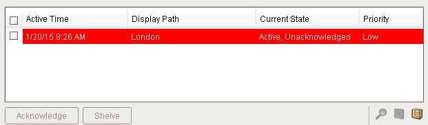
The alarm status table displays the current state of the alarm system. It can be configured to show active, unacknowledged, cleared, and acknowledged alarms. By default it shows all non-cleared/non-ack'ed alarms.
Acknowledgement is handled by selecting (checking) alarms and pressing the "Acknowledge" button. If any of the selected alarms require acknowledge notes, then a small text area will be presented in which the operator must add notes to the acknowledgement.
Shelving is supported by pressing the "Shelve" button when an alarm is selected. This will temporarily remove the alarm from the entire alarm system (not just the local client). When the time is up, if the alarm is still active, it will pop back into the alarm system. The times shown to the user are customizable by editing the values inside the "Shelving Times" dataset property. The alarms that have been shelved can be un-shelved by pushing the shelf management button in the lower right-hand side of the component.
If a more simplified alarm status table is needed, many of the features of the status table can be removed, for example, the header, footer, and multi-selection checkboxes. If a very short alarm status table is needed, turn on the "Marquee Mode" option, which will automatically scroll through any alarms if there is not enough vertical space to show all of them at once.
To change the columns that are displayed, the order of the columns, and/or the column width, put the Designer into preview mode. Then right-click on the table header to show/hide columns. Click and drag to re-order columns, and drag the margins of the columns to resize their width. No further action is necessary - the column configuration will remain in place after the window is saved.
For alarms that originate from tags that have tag history turned on, users can see an automatic ad-hoc chart for the value of the source tag by pressing the chart button.
An Example of configuring the Alarm Status Table can be found on the Alarm Status Table Component page.
|
Name |
Description |
Property Type |
Scripting |
Category |
|
Antialias |
Draw with antialias on? Makes text smoother |
boolean |
.antialias |
Appearance |
|
Border |
The border surrounding this component. NOTE that the border is unaffected by rotation. |
Border |
.border |
Common |
|
Chart Resolution |
The resolution for the ad-hoc tag historian chart. |
int |
.chartResolution |
Behavior |
|
Data Quality |
The data quality code for any tag bindings on this component. |
int |
.dataQuality |
Data |
|
Date Format |
A date format pattern used to format dates in the table. If blank, the default format for the locale is used. |
String |
.dateFormat |
Appearance |
|
Display Path Filter |
Filter alarms by alarm display path, falling back to the source path if display path isn't set. Specify multiple paths by separating them with commas. Supports the wildcard "*". |
String |
.displayPathFilter |
Filters |
|
Enabled |
If disabled, a component cannot be used. |
boolean |
.componentEnabled |
Common |
|
Flash Interval |
The time interval to use for flashing row styles. |
int |
.flashInterval |
Appearance |
|
Journal Name |
The name of the alarm journal to query for the chart's annotations. Leave this blank to automatically pick the journal if there is only one. |
String |
.alarmJournalName |
Behavior |
|
Marquee Mode |
Turn the table into a scrolling marquee |
boolean |
.marqueeMode |
Behavior |
|
Min Priority |
The minimum priority alarm to be displayed by this table. |
int |
.minPriority |
Filters |
|
Multi Select |
Allow multi select. Will show/hide the checkbox column. |
boolean |
.multiSelect |
Behavior |
|
Name |
The name of this component. |
String |
.name |
Common |
|
Notes Area Border |
The border surrounding the notes area. |
Border |
.notesAreaBorder |
Appearance |
|
Notes Area Font |
The font for the notes area. |
Font |
.notesAreaFont |
Appearance |
|
Notes Area Location |
The location of the notes display area |
int |
.notesAreaLocation |
Appearance |
|
Notes Area Size |
The size of the notes area, in pixels. |
int |
.notesAreaSize |
Appearance |
|
Number Format |
A number format string to control the format of the value column. |
String |
.numberFormat |
Appearance |
|
Refresh Rate |
The rate at which this table will poll changes to the alarm status. |
long |
.refreshRate |
Behavior |
|
Row Height |
The height, in pixels, for each row of the table. |
int |
.rowHeight |
Appearance |
|
Row Styles |
A dataset containing the different styles configured for different alarm states. |
Dataset |
.rowStyles |
Appearance |
|
Scroll Delay |
The time (in mSec) to wait between performing each step in a scroll |
int |
.scrollDelay |
Behavior |
|
Selected Alarms |
A dataset containing each selected alarm. (Read-only) |
Dataset |
.selectedAlarms |
Data |
|
Selection Color |
The color of the selection border |
Color |
.selectionColor |
Appearance |
|
Selection Thickness |
The size of the selection border |
int |
.selectionThickness |
Appearance |
|
Shelving Times |
This dataset holds the times that are suggested when shelving an alarm. Allowable units are "second", "minute", or "hour". |
Dataset |
.shelvingTimes |
Data |
|
Show Ack Button |
Show the acknowledge button on the footer panel. |
boolean |
.showAck |
Appearance |
|
Show Active and Acked |
Show alarms that are active and acknowledged. |
boolean |
.activeAndAcked |
Filters |
|
Show Active and Unacked |
Show alarms that are active and unacknowledged. |
boolean |
.activeAndUnacked |
Filters |
|
Show Chart Button |
Show the chart button on the footer panel. |
boolean |
.showChart |
Appearance |
|
Show Clear and Acked |
Show alarms that are cleared and acknowledged. |
boolean |
.clearAndAcked |
Filters |
|
Show Clear and Unacked |
Show alarms that are cleared and unacknowledged. |
boolean |
.clearAndUnacked |
Filters |
|
Show Details Button |
Show the view details button on the footer panel. |
boolean |
.showDetails |
Appearance |
|
Show Footer |
Show a footer with acknowledge and shelf functions below the alarms. |
boolean |
.showFooterPanel |
Appearance |
|
Show Header Popup |
Toggles the table header's built-in column selection popup menu. |
boolean |
.showTableHeaderPopup |
Appearance |
|
Show Manage Shelf Button |
Show the manage shelf button on the footer panel. |
boolean |
.showManageShelf |
Appearance |
|
Show Shelve Button |
Show the shelve button on the footer panel. |
boolean |
.showShelve |
Appearance |
|
Show Table Header |
Toggles visibility of the table's header. |
boolean |
.showTableHeader |
Appearance |
|
Sort Oldest First |
Sort times by oldest first. |
boolean |
.sortOldestFirst |
Behavior |
|
Sort Order |
The default sort order for alarms in the status table. |
int |
.sortOrder |
Behavior |
|
Source Filter |
Filter alarms by alarm source path. Specify multiple paths by separating them with commas. Supports the wildcard "*". |
String |
.sourceFilter |
Filters |
|
Stay Delay |
The time (in mSec) to wait between scrolls |
int |
.stayDelay |
Behavior |
|
Table Background |
The background of the alarm table. |
Color |
.tableBackground |
Appearance |
|
Table Header Font |
The font for the table header. |
Font |
.tableHeaderFont |
Appearance |
|
Touchscreen Mode |
Controls when this input component responds if touchscreen mode is enabled. |
int |
.touchscreenMode |
Behavior |
|
Visible |
If disabled, the component will be hidden. |
boolean |
.visible |
Common |
.print(fitWidth, headerFormat, footerFormat, showDialog, landscape)
-
Description
This specialized print function will paginate the table onto multiple pages. This function accepts keyword-style invocation.
-
Keyword Args
boolean fitWidth - If true, the table's width will be stretched to fit across one page's width. Rows will still paginate normally. If false, thetable will paginate columns onto extra pages. (default = true) [optional]
string headerFormat - A string to use as the table's page header. The substring "{0}" will be replaced with the current page number. (default = None) [optional]
string footerFormat - A string to use as the table's page footer. The substring "{0}" will be replaced with the current page number. (default = "Page {0}") [optional]
boolean showDialog - Whether or not the print dialog should be shown to the user. Default is true . [optional]
boolean landscape - Used to specify portrait (0) or landscape (1) mode. Default is portrait (0). [optional]
-
Return
Boolean- True if the print job was successful.
-
Scope
Client
createPopupMenu
-
Description
Returns a popup menu that will be displayed when the user triggers a popup menu (right click) in the table. Use system.gui.PopupMenu() to create the popup menu.
-
Parameters
Component self - A reference to the component that is invoking this function.
List selectedAlarmEvents - The alarm events selected on the Alarm Status Table. For an individual alarm Event, call alarmEvent.get('propertyName') to inspect. Common properties: 'name', 'source', 'priority'.
-
Return
Object - the popup menu.
-
Scope
Client
filterAlarm
-
Description
Called for each event loaded into the alarm status table. Return false to hide this event from the table. This code is executed in a background thread.
-
Parameters
Component self- A reference to the component that is invoking this function.
Alarm Event alarmEvent - The alarm event itself. Call alarmEvent.get('propertyName') to inspect. Common properties: 'name', 'source','priority'.
-
Return
Boolean - Returns true or false for every alarm event in the table. True will show the alarm. False will not show the alarm.
-
Scope
Client
isAcknowledgeEnabled
-
Description
Returns a boolean that represents whether the selected alarm can be acknowledged
-
Parameters
Component self- A reference to the component that is invoking this function.
List selectedAlarmEvents - The alarm events selected on the Alarm Status Table. For an individual alarmEvent, call alarmEvent.get('propertyName') to inspect. Common properties: 'name','source','priority'.
-
Return
Boolean - Returns true or false for every alarm event in the table.
-
Scope
Client
isShelvedEnabled
-
Description
Returns a boolean that represents whether the selected alarm can be shelved.
-
Parameters
Component self- A reference to the component that is invoking this function.
List selectedAlarmEvents - The alarm events selected on the Alarm Status Table. For an individual alarmEvent, call alarmEvent.get('propertyName') to inspect. Common properties: 'name', 'source', 'priority'.
-
Return
Boolean - Returns true or false for every alarm event in the table.
-
Scope
Client
onDoubleClicked
-
Description
Called when an alarm is double-clicked on to provide custom functionality.
-
Parameters
Component self- A reference to the component that is invoking this function.
Alarm Event alarmEvent - The alarm event that was double clicked. For an individual alarmEvent, call alarmEvent.get('propertyName') to inspect. Common properties: 'name', 'source', 'priority'.
-
Return
Nothing
-
Scope
Client
onAcknowledge
-
Description
Called when the Acknowledge button is pressed; the script runs before the ack happens. Return False to abort the acknowledgement, return True to continue as normal.
-
Parameters
Component self- A reference to the component that is invoking this function.
List alarms - A list of the alarms to be acknowledged.
-
Return
Boolean - Returns true or false for every alarm event that is selected.
-
Scope
Client
propertyChange
propertyChange
Fires whenever a bindable property of the source component changes. This works for standard and custom (dynamic) properties.
|
.source |
The component that fired this event |
|
.newValue |
The new value that this property changed to. |
|
.oldValue |
The value that this property was before it changed. Note that not all components include an accurate oldValue in their events. |
|
.propertyName |
The name of the property that changed. NOTE: remember to always filter out these events for the property that you are looking for! Components often have many properties that change. |
The Alarm Status Table has a customizer.
#The following code is an example of the filter alarm expression function. #The function results in advanced filtering for the alarm table. #In this example the alarm table will only show alarms with a name that matches the value of the "AreaName" property located on the container the Alarm Status Table resides in.name = self.parent.AreaNameif name == alarmEvent.get('name'): return Trueelse: return False