Text Field
Component Palette Icon:

The Text Field component is used for input of any single-line text. This component will accept any alpha-numeric input. If you're looking for a numeric field, see the Numeric Text Field.
This field features a protected mode. When you enable the protectedMode property, the field is not editable even when it receives input focus. The user must double click on the field or press enter in order to edit the field. When they are done (press enter again or leave the field), the field becomes non-editable again.
The Text Field also supports the reject updates during edit feature. This feature ignores updates coming from property bindings while the component is being edited by a user.
|
Name |
Description |
Property Type |
Scripting |
Category |
|
Antialias |
Draw with antialias on? Makes text smoother |
boolean |
.antialias |
Appearance |
|
Background |
The background color of the text box (when editable) |
Color |
.editableBackground |
Appearance |
|
Border |
The border surrounding this component. NOTE that the border is unaffected by rotation. |
Border |
.border |
Common |
|
Commit On Focus Loss |
If true, any pending edit will take effect when focus is lost. If false, the user must press ENTER for an edit to take effect. |
boolean |
.commitOnFocusLost |
Behavior |
|
Cursor |
The mouse cursor to use when hovering over this component. |
int |
.cursorCode |
Common |
|
Data Quality |
The data quality code for any tag bindings on this component. |
int |
.dataQuality |
Data |
|
Defer Updates |
When true, the 'text' property will not fire updates while typing, it will wait for Enter to be pressed. |
boolean |
.deferUpdates |
Behavior |
|
Editable? |
If true, this is an input box, if false, this is display-only. |
boolean |
.editable |
Behavior |
|
Enabled |
If disabled, a component cannot be used. |
boolean |
.componentEnabled |
Common |
|
Font |
Font of text of this component |
Font |
.font |
Appearance |
|
Foreground Color |
The foreground color of the component. |
Color |
.foreground |
Appearance |
|
Horizontal Alignment |
Determines the alignment of the label's contents along the X axis |
int |
.horizontalAlignment |
Layout |
|
Maximum Characters |
The text box will be limited to this number of characters. Use -1 for unlimited. |
int |
.maxChars |
Behavior |
|
Mouseover Text |
The text that is displayed in the tooltip which pops up on mouseover of this component. |
String |
.toolTipText |
Common |
|
Name |
The name of this component. |
String |
.name |
Common |
|
Non-Editable Background |
The background color to use when this text box is non-editable |
Color |
.nonEditableBackground |
Appearance |
|
Protected Mode? |
If true, users will need to double-click in the field in order to edit the text. |
boolean |
.protectedMode |
Behavior |
|
Reject Updates During Edit |
If true, this field will not accept updates from external sources (like DB bindings)<BR>while the user is editing the field. |
boolean |
.rejectUpdatesDuringEdit |
Behavior |
|
Styles |
Contains the component's styles |
Dataset |
.styles |
Appearance |
|
Text |
Text of this component |
String |
.text |
Data |
|
Touchscreen Mode |
Controls when this input component responds if touchscreen mode is enabled. |
int |
.touchscreenMode |
Behavior |
|
Visible |
If disabled, the component will be hidden. |
boolean |
.visible |
Common |
getSelectedText()
-
Description
Returns the currently selected or highlighted text in the text field.
-
Parameters
Nothing
-
Return
String - Returns the currently selected or highlighted text in the text field.
-
Scope
Client
This component does not have extension functions associated with it.
focus
focusGained
This event occurs when a component that can receive input, such as a text box, receives the input focus. This usually occurs when a user clicks on the component or tabs over to it.
|
.source |
The component that fired this event. |
|
.oppositeComponent |
The other component involved in this focus change. That is, the component that lost focus in order for this one to gain it, or vise versa. |
focusLost
This event occurs when a component that had the input focus lost it to another component.
|
.source |
The component that fired this event |
|
.oppositeComponent |
The other component involved in this focus change. That is, the component that lost focus in order for this one to gain it, or vise versa. |
key
keyPressed
An integer that indicates whether the state was changed to "Selected" (on) or "Deselected" (off). Compare this to the event object's constants to determine what the new state is.
|
.source |
The component that fired this event. |
|
.keyCode |
The key code for this event. Used with the keyPressed and keyReleased events. See below for the key code constants. |
|
.keyChar |
The character that was typed. Used with the keyTyped event. |
|
.keyLocation |
Returns the location of the key that originated this key event. Some keys occur more than once on a keyboard, e.g. the left and right shift keys. Additionally, some keys occur on the numeric keypad. This provides a way of distinguishing such keys. See the KEY_LOCATION constants, the keyTyped event always has a location of KEY_LOCATION_UNKNOWN. |
|
.altDown |
True (1) if the Alt key was held down during this event, false (0) otherwise. |
|
.controlDown |
True (1) if the Control key was held down during this event, false (0) otherwise. |
|
.shiftDown |
True (1) if the Shift key was held down during this event, false (0) otherwise. |
keyReleased
Fires when a key is released and the source component has the input focus. Works for all characters, including non-printable ones, such as SHIFT and F3.
|
.source |
The component that fired this event. |
|
.keyCode |
The key code for this event. Used with the keyPressed and keyReleased events. See below for the key code constants. |
|
.keyChar |
The character that was typed. Used with the keyTyped event. |
|
.keyLocation |
Returns the location of the key that originated this key event. Some keys occur more than once on a keyboard, e.g. the left and right shift keys. Additionally, some keys occur on the numeric keypad. This provides a way of distinguishing such keys. See the KEY_LOCATION constants in the documentation, the keyTyped event always has a location of KEY_LOCATION_UNKNOWN. |
|
.altDown |
True (1) if the Alt key was held down during this event, false (0) otherwise. |
|
.controlDown |
True (1) if the Control key was held down during this event, false (0) otherwise. |
|
.shiftDown |
True (1) if the Shift key was held down during this event, false (0) otherwise. |
keyTyped
Fires when a key is pressed and then released when source component has the input focus. Only works for characters that can be printed on the screen.
|
.source |
The component that fired this event. |
|
.keyCode |
The key code for this event. Used with the keyPressed and keyReleased events. See below for the key code constants. |
|
.keyChar |
The character that was typed. Used with the keyTyped event. |
|
.keyLocation |
Returns the location of the key that originated this key event. Some keys occur more than once on a keyboard, e.g. the left and right shift keys. Additionally, some keys occur on the numeric keypad. This provides a way of distinguishing such keys. See the KEY_LOCATION constants in the documentation, the keyTyped event always has a location of KEY_LOCATION_UNKNOWN. |
|
.altDown |
True (1) if the Alt key was held down during this event, false (0) otherwise. |
|
.controlDown |
True (1) if the Control key was held down during this event, false (0) otherwise. |
|
.shiftDown |
True (1) if the Shift key was held down during this event, false (0) otherwise. |
mouse
mouseClicked
This event signifies a mouse click on the source component. A mouse click the combination of a mouse press and a mouse release, both of which must have occurred over the source component. Note that this event fires after the pressed and released events have fired.
|
.source |
The component that fired this event. |
|
.button |
The code for the button that caused this event to fire. |
|
.clickCount |
The number of mouse clicks associated with this event. |
|
.x |
The x-coordinate (with respect to the source component) of this mouse event. |
|
.y |
The y-coordinate (with respect to the source component) of this mouse event. |
|
.popupTrigger |
Returns True (1) if this mouse event is a popup trigger. What constitutes a popup trigger is operating system dependent, which is why this abstraction exists. |
|
.altDown |
True (1) if the Alt key was held down during this event, false (0) otherwise. |
|
.controlDown |
True (1) if the Control key was held down during this event, false (0) otherwise. |
|
.shiftDown |
True (1) if the Shift key was held down during this event, false (0) otherwise. |
mouseEntered
This event fires when the mouse enters the space over the source component.
|
.source |
The component that fired this event. |
|
.button |
The code for the button that caused this event to fire. |
|
.clickCount |
The number of mouse clicks associated with this event. |
|
.x |
The x-coordinate (with respect to the source component) of this mouse event. |
|
.y |
The y-coordinate (with respect to the source component) of this mouse event. |
|
.popupTrigger |
Returns True (1) if this mouse event is a popup trigger. What constitutes a popup trigger is operating system dependent, which is why this abstraction exists. |
|
.altDown |
True (1) if the Alt key was held down during this event, false (0) otherwise. |
|
.controlDown |
True (1) if the Control key was held down during this event, false (0) otherwise. |
|
.shiftDown |
True (1) if the Shift key was held down during this event, false (0) otherwise. |
mouseExited
This event fires when the mouse leaves the space over the source component.
|
.source |
The component that fired this event. |
|
.button |
The code for the button that caused this event to fire. |
|
.clickCount |
The number of mouse clicks associated with this event. |
|
.x |
The x-coordinate (with respect to the source component) of this mouse event. |
|
.y |
The y-coordinate (with respect to the source component) of this mouse event. |
|
.popupTrigger |
Returns True (1) if this mouse event is a popup trigger. What constitutes a popup trigger is operating system dependent, which is why this abstraction exists. |
|
.altDown |
True (1) if the Alt key was held down during this event, false (0) otherwise. |
|
.controlDown |
True (1) if the Control key was held down during this event, false (0) otherwise. |
|
.shiftDown |
True (1) if the Shift key was held down during this event, false (0) otherwise. |
mousePressed
This event fires when a mouse button is pressed down on the source component.
|
.source |
The component that fired this event. |
|
.button |
The code for the button that caused this event to fire. |
|
.clickCount |
The number of mouse clicks associated with this event. |
|
.x |
The x-coordinate (with respect to the source component) of this mouse event. |
|
.y |
The y-coordinate (with respect to the source component) of this mouse event. |
|
.popupTrigger |
Returns True (1) if this mouse event is a popup trigger. What constitutes a popup trigger is operating system dependent, which is why this abstraction exists. |
|
.altDown |
True (1) if the Alt key was held down during this event, false (0) otherwise. |
|
.controlDown |
True (1) if the Control key was held down during this event, false (0) otherwise. |
|
.shiftDown |
True (1) if the Shift key was held down during this event, false (0) otherwise. |
mouseReleased
This event fires when a mouse button is released, if that mouse button's press happened over this component.
|
.source |
The component that fired this event. |
|
.button |
The code for the button that caused this event to fire. |
|
.clickCount |
The number of mouse clicks associated with this event. |
|
.x |
The x-coordinate (with respect to the source component) of this mouse event. |
|
.y |
The y-coordinate (with respect to the source component) of this mouse event. |
|
.popupTrigger |
Returns True (1) if this mouse event is a popup trigger. What constitutes a popup trigger is operating system dependent, which is why this abstraction exists. |
|
.altDown |
True (1) if the Alt key was held down during this event, false (0) otherwise. |
|
.controlDown |
True (1) if the Control key was held down during this event, false (0) otherwise. |
|
.shiftDown |
True (1) if the Shift key was held down during this event, false (0) otherwise. |
mouseMotion
mouseDragged
Fires when the mouse moves over a component after a button has been pushed.
|
.source |
The component that fired this event. |
|
.button |
The code for the button that caused this event to fire. |
|
.clickCount |
The number of mouse clicks associated with this event. |
|
.x |
The x-coordinate (with respect to the source component) of this mouse event. |
|
.y |
The y-coordinate (with respect to the source component) of this mouse event. |
|
.popupTrigger |
Returns True (1) if this mouse event is a popup trigger. What constitutes a popup trigger is operating system dependent, which is why this abstraction exists. |
|
.altDown |
True (1) if the Alt key was held down during this event, false (0) otherwise. |
|
.controlDown |
True (1) if the Control key was held down during this event, false (0) otherwise. |
|
.shiftDown |
True (1) if the Shift key was held down during this event, false (0) otherwise. |
mouseMoved
Fires when the mouse moves over a component, but no buttons are pushed.
|
.source |
The component that fired this event. |
|
.button |
The code for the button that caused this event to fire. |
|
.clickCount |
The number of mouse clicks associated with this event. |
|
.x |
The x-coordinate (with respect to the source component) of this mouse event. |
|
.y |
The y-coordinate (with respect to the source component) of this mouse event. |
|
.popupTrigger |
Returns True (1) if this mouse event is a popup trigger. What constitutes a popup trigger is operating system dependent, which is why this abstraction exists. |
|
.altDown |
True (1) if the Alt key was held down during this event, false (0) otherwise. |
|
.controlDown |
True (1) if the Control key was held down during this event, false (0) otherwise. |
|
.shiftDown |
True (1) if the Shift key was held down during this event, false (0) otherwise. |
propertyChange
propertyChange
Fires whenever a bindable property of the source component changes. This works for standard and custom (dynamic) properties.
|
.source |
The component that fired this event. |
|
.newValue |
The new value that this property changed to. |
|
.oldValue |
The value that this property was before it changed. |
|
.propertyName |
The name of the property that changed. NOTE: remember to always filter out these events for the property that you are looking for! Components often have many properties that change. |
#The following code will return the value of the text box's previous value into a variable.#This code is fired on the propertyChange event for this component. oldValue = event.source.oldValue 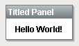
|
Property Name |
Value |
|
Border |
Tabbed Border with Title |
|
Font |
Dialog, Bold, 12 |
|
Horizontal Alignment |
Center |